CSS Architecture, Design Systems and Accessibility
On this page
Learning Objective
Organize styling with design tokens and a small set of scoped conventions, build reusable components on accessible primitives, verify accessibility with automated and manual checks, and avoid the security problems that dynamic styles and links can introduce.
Concept Explanation
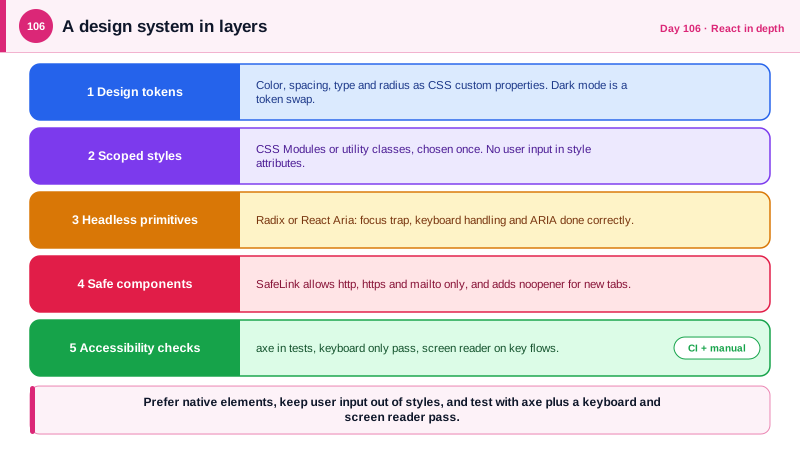
Styling scales badly when every component invents its own colors, spacing, and breakpoints. A design system fixes that by naming decisions once. The foundation is design tokens: named values for color, spacing, type size, radius, and elevation, exposed as CSS custom properties so that a theme, such as dark mode, is a different set of values for the same names. Components then consume tokens instead of literals, and a change to the brand color happens in one file. The method for scoping styles matters less than picking one and applying it consistently. CSS Modules give locally scoped class names with plain CSS, utility-first libraries such as Tailwind trade separate stylesheets for composed classes, and runtime CSS-in-JS libraries add runtime cost and complicate server rendering and strict Content Security Policy, which is why many teams have moved away from them.
The larger decision for a full-stack team is whether to build components or assemble them from headless primitives. Accessible interactive components are hard: a dialog must trap focus, restore it on close, close on Escape, and be announced correctly by screen readers, and a combobox has a long list of keyboard and ARIA requirements. Libraries such as Radix UI, React Aria, and Headless UI implement that behavior without imposing visual style, so your design system supplies the look and the library supplies the interaction. The first rule of ARIA is to prefer native elements: a button element gets focus, keyboard activation, and semantics for free, while a clickable div needs all of it added by hand and usually gets it wrong.
Accessibility is also a legal and quality requirement, measured against the Web Content Accessibility Guidelines, with version 2.2 published in October 2023. Automated tools catch only a portion of the issues, such as missing labels and low contrast, so combine them with a keyboard-only pass, a screen reader check on key flows, zoom to 200 percent, and respect for the reduced-motion preference. Bake the automated checks into the pipeline with axe rules in component tests and in the Playwright suite from Day 76, so regressions fail the build.
Styling has security edges that are easy to overlook. Building inline styles or class names from user input can allow CSS injection, and even without script execution, attacker-controlled CSS has been used to exfiltrate data through attribute selectors and background image requests, so keep user-controlled values out of style attributes and stylesheets, and prefer a strict CSP that limits style sources. A shared link component is the right place to enforce safety: it should allow only expected URL protocols, reject javascript: URLs, and add rel="noopener noreferrer" to links that open a new tab. Centralizing this in the design system means every screen inherits the protection.
| Concern | Recommended approach | Why |
|---|---|---|
| Colors, spacing, type | Design tokens as CSS custom properties | One change themes the whole app, dark mode is a token swap |
| Scoping styles | CSS Modules or utility classes, chosen once | Avoids global collisions and runtime style injection |
| Complex widgets | Headless primitives such as Radix or React Aria | Correct focus, keyboard and ARIA behavior for free |
| Native semantics | button, a, label, fieldset before ARIA roles | Built-in keyboard and screen reader support |
| Accessibility checks | axe in tests plus manual keyboard and screen reader passes | Automation finds only part of the problems |
| Links and user styles | A safe Link component, no user input in styles | Blocks javascript: URLs and CSS injection |
Worked Example: Tokens, a Safe Link and an Accessible Dialog with a Test
The tokens define light and dark themes. The Link component enforces protocols. The dialog uses a headless primitive, and the test runs axe.
/* tokens.css: decisions are named once, components use the names */
:root {
  --color-bg: #ffffff;
  --color-text: #0f172a;
  --color-primary: #1d4ed8;          /* checked for 4.5:1 contrast against the background */
  --space-2: 0.5rem;
  --space-4: 1rem;
  --radius-md: 0.5rem;
}
:root[data-theme='dark'] {
  --color-bg: #0b1120;
  --color-text: #e2e8f0;
  --color-primary: #93c5fd;
}
.button { background: var(--color-primary); color: var(--color-bg); padding: var(--space-2) var(--space-4); border-radius: var(--radius-md); }
.button:focus-visible { outline: 3px solid currentColor; outline-offset: 2px; }   /* never remove focus indicators */
@media (prefers-reduced-motion: reduce) { * { animation: none !important; transition: none !important; } }// SafeLink.tsx: one place that decides which URLs the app will ever navigate to.
const ALLOWED = new Set(['http:', 'https:', 'mailto:']);
export function SafeLink({ href, children, ...rest }: React.AnchorHTMLAttributes<HTMLAnchorElement>) {
let safe = '#';
try {
const url = new URL(href ?? '', window.location.origin);
if (ALLOWED.has(url.protocol)) safe = url.href; // javascript: and data: fall through to '#'
} catch { /* invalid URL stays '#' */ }
const external = safe.startsWith('http') && new URL(safe).origin !== window.location.origin;
return <a href={safe} {...rest} {...(external ? { target: '_blank', rel: 'noopener noreferrer' } : {})}>{children}</a>;
}// ConfirmDialog.tsx: Radix handles focus trap, Escape, focus return and ARIA wiring.
import * as Dialog from '@radix-ui/react-dialog';
export function ConfirmDelete({ onConfirm }: { onConfirm: () => void }) {
return (
<Dialog.Root>
<Dialog.Trigger className="button">Delete project</Dialog.Trigger>
<Dialog.Portal>
<Dialog.Overlay className="overlay" />
<Dialog.Content className="dialog">
<Dialog.Title>Delete this project?</Dialog.Title>
<Dialog.Description>All tasks in the project will be removed. This cannot be undone.</Dialog.Description>
<Dialog.Close className="button" onClick={onConfirm}>Delete</Dialog.Close>
<Dialog.Close className="button secondary">Cancel</Dialog.Close>
</Dialog.Content>
</Dialog.Portal>
</Dialog.Root>
);
}// ConfirmDelete.a11y.test.tsx: a regression fails the build, though it does not replace a manual pass.
import { axe } from 'vitest-axe';
it('has no detectable accessibility violations when open', async () => {
const { container } = render(<ConfirmDelete onConfirm={() => {}} />);
await userEvent.click(screen.getByRole('button', { name: /delete project/i }));
expect(await axe(document.body)).toHaveNoViolations();
});Notice that the dialog text states the consequence and the destructive button is named for the action, which helps everyone, and that the token contrast values are checked once instead of on every screen.
Real-World Examples
- The WebAIM Million study, which scans the home pages of the top one million sites each year, has consistently found detectable WCAG failures on more than nine out of ten of them, with low contrast text, missing alternative text, and unlabeled form fields the most common. It is why automated checks catch a large share of real problems, and why they are worth adding to every pipeline.
- In 2019 the United States Supreme Court declined to hear Domino's Pizza's appeal in a case about the accessibility of its website and app, leaving in place a ruling that the Americans with Disabilities Act applied to them. In Europe, the European Accessibility Act began applying to many consumer products and services in June 2025, so accessibility is a compliance matter for many teams and not only a courtesy.
Review Questions & Answers
They name each design decision once, so components refer to the name and a change to a color, spacing scale, or theme happens in a single place. Dark mode becomes a different set of values for the same token names instead of a second stylesheet.
Accessible interactive widgets need focus trapping, focus restoration, keyboard handling, and correct ARIA attributes, which are easy to get wrong. A headless library supplies that behavior tested across screen readers, and you supply the visual style.
Tools can detect issues such as missing labels or low contrast, but they cannot judge whether the tab order is sensible, whether a screen reader announcement makes sense, or whether a flow is usable by keyboard. Manual checks with keyboard and assistive technology are still needed for key flows.
A link with a javascript: URL can run script when clicked, and user-controlled values in styles can enable CSS injection that leaks or alters content. A shared link component that allows only expected protocols, a strict Content Security Policy, and never placing user input in style attributes prevent both.