Critical Rendering Path Explained
On this page
Learning Objective
Explain each step the browser takes to turn HTML and CSS into pixels: building the DOM and CSSOM, combining them into a render tree, computing layout, painting and compositing. Predict which kinds of change trigger which steps, so you can reason about rendering cost before measuring it.
Concept Explanation
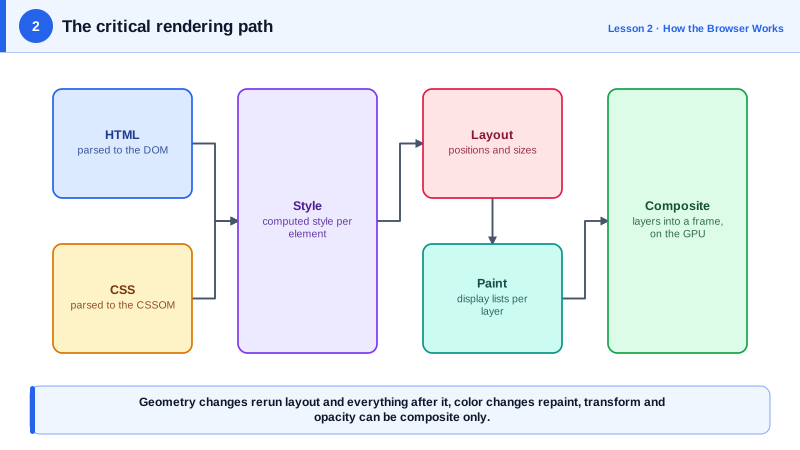
The critical rendering path is the sequence of work between receiving HTML and CSS and showing pixels. The browser parses HTML into the Document Object Model, a tree of nodes. In parallel it parses CSS into the CSS Object Model, a structure of rules. Neither alone is enough to draw anything: the DOM knows what exists, the CSSOM knows how things should look. The browser therefore matches selectors against elements to compute every element's final style, a step called style recalculation.
From the styled DOM the browser builds the render tree, sometimes called the layout tree, which contains only what will be drawn. Elements with display none are excluded entirely, and so are things like the head element and script tags. Pseudo-elements such as ::before do appear, even though they have no DOM node. An element with visibility hidden stays in the tree because it still takes up space; it is simply not painted.
Layout, also called reflow, calculates the exact position and size of every box in the render tree, starting from the viewport and working down. This is where percentages become pixels, text wraps into lines, and flex and grid algorithms run. Layout is often the most expensive step because a change to one element can affect the geometry of its parent, siblings and children.
Paint turns boxes into drawing instructions: fill this rectangle, draw this text run, draw this border and shadow. Modern browsers record these instructions into display lists and divide the page into layers. Compositing then takes those layers, rasterizes them into bitmaps, often on the GPU, and assembles them into the final frame. Because layers are drawn separately, the compositor can move, scale or fade a layer without repainting it, which is why transform and opacity animations are cheap (Day 8).
The practical value of the model is prediction. Changing a property that affects geometry, such as width, top or font-size, invalidates layout, then paint, then compositing. Changing a property that affects only appearance, such as color or background, skips layout but still repaints. Changing transform or opacity on an element that has its own layer can skip both and run only compositing. The browser targets one frame every 16.7 milliseconds on a 60 Hz display, so the less of this pipeline a change triggers, the more likely the frame arrives on time.
| Step | Input | Output | Triggered by changing |
|---|---|---|---|
| Parse HTML | Bytes of HTML | DOM tree | Adding or removing elements |
| Parse CSS | Bytes of CSS | CSSOM | Adding stylesheets or rules |
| Style | DOM and CSSOM | Computed style per element | Class changes, any CSS property |
| Layout | Render tree | Box positions and sizes | width, height, top, font-size, content |
| Paint | Boxes and styles | Display lists per layer | color, background, box-shadow |
| Composite | Painted layers | The final frame | transform, opacity on a layered element |
Worked Example: Watching the Pipeline React to Different Changes
This page changes three different properties on three boxes. Record a few seconds in the DevTools Performance panel while it runs and compare the purple Layout, green Paint and Composite entries for each button.
<!doctype html>
<class="tok-k">style>
  .box { width: 120px; height: 120px; margin: 12px; background: #6b21a8; }
</class="tok-k">style>
<class="tok-k">button id="geo">Change width (layout)</class="tok-k">button>
<class="tok-k">button id="paint">Change color (paint)</class="tok-k">button>
<class="tok-k">button id="comp">Change transform (composite)</class="tok-k">button>
<class="tok-k">div class="box" id="a"></class="tok-k">div>
<class="tok-k">div class="box" id="b"></class="tok-k">div>
<class="tok-k">div class="box" id="c" style="will-change: transform"></class="tok-k">div>
<class="tok-k">script>
  let n = 0;
  geo.onclick = () => {
    a.style.width = (120 + (++n % 2) * 60) + 'px';   // style, layout, paint, composite
  };
  paint.onclick = () => {
    b.style.background = n++ % 2 ? '#6b21a8' : '#db2777';   // style, paint, composite
  };
  comp.onclick = () => {
    c.style.transform = `translateX(${(n++ % 2) * 60}px)`;   // style, composite only
  };
</class="tok-k">script>
In the recording, the width change shows a Layout event followed by paint, the color change shows paint without layout, and the transform change on the box promoted with will-change shows only a composite step. The same reasoning scales up: a page that animates width on dozens of elements does layout every frame, while one that animates transform does not.
Real-World Examples
- The Chrome team's "Inside look at modern web browser" series and the RenderingNG architecture documents describe the same stages: style, layout, pre-paint, paint and compositing, with rasterization done off the main thread so that scrolling and compositor animations stay smooth when JavaScript is busy.
- The site csstriggers.com, created by Paul Lewis, catalogued which CSS properties trigger layout, paint or only compositing in each browser engine, and it became a standard reference when teams chose which properties to animate.
Review Questions & Answers
An element with display none generates no box, so it is excluded from the render tree and takes no space. An element with visibility hidden still generates a box and still occupies space in layout, so it stays in the render tree; it is only skipped during painting.
Layout is about geometry and geometry is interdependent. Changing one element's size can move its siblings, resize its parent and rewrap the text inside it, so the browser may need to recompute a large part of the tree. Paint is more local: changing a color affects only the pixels of that element.
The compositor takes separately painted layers and assembles them into the final frame, usually on a separate thread with GPU help. If an animation only moves, scales or fades a layer, the compositor can produce new frames without running style, layout or paint on the main thread, so the animation stays smooth even when JavaScript is busy.
Animate transform with translateX. Changing left changes geometry and forces layout and paint on every frame, while transform on an element with its own layer can be handled entirely by the compositor. The visual result is the same but transform is far cheaper and more reliably smooth.