Image and Font Optimization: AVIF and font-display
On this page
Learning Objective
Deliver images in the right format, size and compression through build tooling or an image CDN, load them with the right priority, and load web fonts efficiently with WOFF2, subsetting, variable fonts, preloading and font-display, so that media and typography never dominate loading time or cause shifts.
Concept Explanation
Images are usually the largest share of page weight, and fonts are a common cause of invisible text and layout shifts. Day 17 covered the HTML for responsive images and Day 85 covered avoiding shifts; today is about producing and delivering the bytes efficiently.
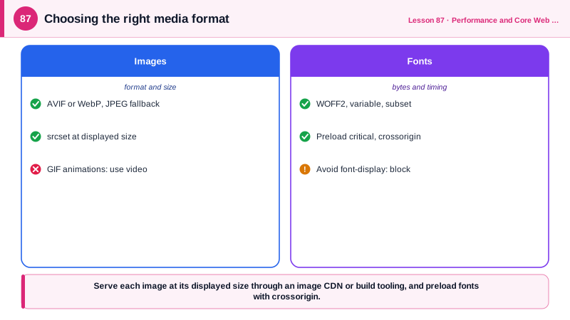
Format choice matters most. AVIF typically produces files roughly half the size of equivalent JPEGs, and WebP about 25 to 35 percent smaller; both support transparency and are supported by all current browsers, with JPEG or PNG as a fallback through the picture element if older browsers matter. SVG is best for logos, icons and simple illustrations, since it is tiny and scales perfectly; it should be optimized with a tool such as SVGO and treated as code when it comes from untrusted sources. PNG remains useful for screenshots that need lossless quality, while GIF should be replaced by video, since an MP4 or WebM loop is usually a fraction of the size of an animated GIF.
Size and compression come next. Serve images no larger than they are displayed, multiplied by the device pixel ratio, through srcset and sizes. Generating all those variants by hand is impractical, so use build-time tooling, such as framework image components or sharp in a build script, or an image CDN that resizes, compresses and converts on request based on URL parameters and the browser's Accept header. Quality settings around 60 to 80 for lossy formats are usually indistinguishable from higher settings at a much smaller size. Strip metadata, which can also leak location data from photos.
Loading priority completes the picture: the LCP image eager with fetchpriority high, everything below the fold lazy, decoding async for large images, and low quality placeholders or dominant color backgrounds to make loading feel faster without shifting layout.
Web fonts have their own pipeline. Use WOFF2, which compresses best and is universally supported. Subset fonts to the characters and languages you need, using unicode-range so the browser downloads only the subsets a page uses, which can cut a font from hundreds of kilobytes to tens. Variable fonts pack many weights and styles into one file, which is often smaller than three or four static weights. Self-host fonts rather than loading them from a third-party font service when you can, avoiding an extra connection; since browsers partition caches by site, a shared font CDN no longer provides cross-site cache hits. Preload only the one or two fonts used above the fold. font-display controls what happens while a font loads: swap shows fallback text immediately and swaps when the font arrives, optional uses the font only if it arrives very quickly and otherwise keeps the fallback for that page view, and block hides text, which should be avoided. Pair either swap or optional with the metric-adjusted fallbacks from Day 85. And use system font stacks where brand typography is not essential, since they cost nothing.
| Asset | Recommendation | Benefit |
|---|---|---|
| Photos | AVIF or WebP with fallback | Often 30 to 50 percent smaller than JPEG |
| Icons and logos | Optimized SVG | Tiny, sharp at any size |
| Animated GIF | MP4 or WebM loop | Many times smaller |
| Variants | Image CDN or build tooling | Right size per device automatically |
| Quality | Around 60 to 80 for lossy formats | Large savings, little visible loss |
| Fonts | WOFF2, subset with unicode-range | Smaller downloads per page |
| Many weights | One variable font | Fewer requests and bytes |
| Font loading | Preload critical, font-display swap or optional | Visible text, controlled swaps |
Worked Example: An Image Component on an Image CDN and a Subset Font Setup
The component builds srcset URLs for an image CDN that converts formats automatically. The font setup self-hosts a variable font with subsets and an adjusted fallback.
const CDN = 'https://img.example-cdn.com';
const WIDTHS = [320, 640, 960, 1280, 1920];

// The CDN negotiates AVIF or WebP from the Accept header and resizes on the fly
function cdnUrl(path: string, width: number, quality = 70) {
  return `${CDN}${path}?w=${width}&q=${quality}&auto=format&strip=all`;
}

export function Picture({ path, alt, width, height, sizes = '100vw', priority = false }:
  { path: string; alt: string; width: number; height: number; sizes?: string; priority?: boolean }) {
  return (
    <img
      src={cdnUrl(path, 960)}
      srcSet={WIDTHS.filter((w) => w <= width * 2).map((w) => `${cdnUrl(path, w)} ${w}w`).join(', ')}
      sizes={sizes}
      width={width}
      height={height}
      alt={alt}
      loading={priority ? 'eager' : 'lazy'}
      fetchPriority={priority ? 'high' : 'auto'}
      decoding="async"
      style={{ backgroundColor: '#e9e4f0' }}       // placeholder color, no layout shift
    />
  );
}/* Self-hosted variable font split into subsets: pages download only what they use */
@font-face {
font-family: 'Inter';
src: url('/fonts/inter-latin.var.woff2') format('woff2');
font-weight: 100 900;
font-display: swap;
unicode-range: U+0000-00FF, U+0131, U+0152-0153, U+2000-206F, U+20AC;
}
@font-face {
font-family: 'Inter';
src: url('/fonts/inter-latin-ext.var.woff2') format('woff2');
font-weight: 100 900;
font-display: swap;
unicode-range: U+0100-024F, U+1E00-1EFF;
}
body { font-family: 'Inter', 'Inter Fallback', system-ui, sans-serif; }<class="tok-k">link rel="preload" href="/fonts/inter-latin.var.woff2" as="font" type="font/woff2" crossorigin>
class="tok-c"><!-- A looping animation as video instead of a GIF -->
<class="tok-k">video autoplay muted loop playsinline width="480" height="270" poster="/demo.jpg">
<class="tok-k">source src="/demo.webm" type="video/webm"><class="tok-k">source src="/demo.mp4" type="video/mp4">
</class="tok-k">video>An English page downloads only the Latin subset, about a quarter of the full font, while a page with Polish or Czech text also downloads the extended subset. The preload uses crossorigin because fonts are always fetched in CORS mode, and without it the preload is wasted.
Real-World Examples
- Netflix's engineering team published research on AVIF while helping develop it, reporting substantial file size savings over JPEG at similar visual quality for its artwork, and AVIF reached all major browsers when Edge added support in 2024.
- Google Fonts serves fonts split by unicode-range subsets and as variable fonts where available, and Chrome's cache partitioning, introduced in 2020, means fonts loaded from a shared CDN are no longer reused across different sites, which strengthened the case for self-hosting fonts.
Review Questions & Answers
GIF compression is very inefficient for motion, so animated GIFs are often several megabytes. An MP4 or WebM loop with autoplay, muted, loop and playsinline attributes looks the same and is typically a small fraction of the size.
It stores original images and generates variants on request: resizing to the requested width, choosing the best format the browser supports through the Accept header, compressing and stripping metadata, and caching the results at the edge, so pages get optimal images without manual processing.
A font family can be split into several files, each declared with the range of characters it covers. The browser downloads a file only if the page contains characters in its range, so pages in one language do not pay for glyphs of other scripts.
Fonts are always requested in CORS mode. A preload without crossorigin is fetched in a different mode, so the browser cannot reuse it for the actual font request and downloads the font twice, wasting the preload.