ARIA Roles, Names and States: Accessible Tabs
On this page
Learning Objective
Build a custom widget that HTML does not provide, a tab interface, by following the ARIA Authoring Practices pattern: correct roles and relationships, accessible names computed from the right source, states kept in sync with the UI, and the expected keyboard model.
Concept Explanation
Sooner or later you need a component that has no native element: tabs, a combobox with suggestions, a tree view, a menu button. These are the cases ARIA was designed for. The ARIA Authoring Practices Guide, published by the W3C, documents each common pattern with the required roles, states, properties and keyboard interactions, and following it closely is much safer than inventing your own model, because screen reader users have learned to expect these patterns.
Every widget needs correct accessible names, and the browser computes them with a defined priority. aria-labelledby wins first: it points at the id of one or more elements whose text becomes the name. Then aria-label, a string. Then the native mechanism for that element, such as a label element or the alt attribute. Then, for roles that allow it such as buttons, links and tabs, the element's text content. Finally the title attribute as a weak fallback. Visible text is the best name in most cases, because sighted voice control users say what they see. A button that shows Search but is named Find products by aria-label cannot be activated by saying click Search.
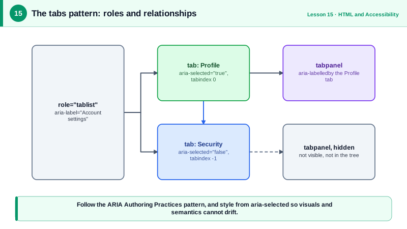
Roles in a composite widget come in families with required relationships. In the tabs pattern, a container has role tablist, each tab has role tab and aria-controls pointing at its panel, and each panel has role tabpanel and aria-labelledby pointing back at its tab. Exactly one tab has aria-selected="true". Required ownership matters: a tab outside a tablist is invalid, and assistive technology may then announce it incorrectly. The accessibility tree in DevTools reports these relationships, which makes it easy to check.
States must be kept in sync with what is on screen. When a tab is selected visually, aria-selected must change; when a panel is hidden, it must actually be hidden with the hidden attribute or display none, not merely moved off screen; when a disclosure opens, aria-expanded must flip. Out of sync states are a common bug in custom widgets, and a reason to drive both the visuals and the ARIA attributes from the same state variable, ideally by styling based on the ARIA attributes themselves, such as a selector for tabs where aria-selected is true.
The keyboard model completes the widget. For tabs, the tablist is one tab stop with a roving tabindex, Left and Right arrows move between tabs, Home and End jump to the first and last, and Tab moves from the active tab into its panel. The pattern allows automatic activation, where focus selects the tab, or manual activation with Enter or Space, which is better when loading a panel is expensive.
| Part | Role or attribute | Purpose |
|---|---|---|
| Container | role="tablist" with aria-label | Groups the tabs and names the set |
| Each tab | role="tab", aria-selected, aria-controls | Selectable item linked to its panel |
| Each panel | role="tabpanel", aria-labelledby | Content named by its tab |
| Focus | Roving tabindex on tabs | One tab stop for the whole list |
| Keys | Arrows, Home, End | Move between tabs |
| Hidden panels | hidden attribute | Removed from view and the tree |
| Naming priority | labelledby, label, native, content, title | Predictable accessible names |
Worked Example: An Accessible Tabs Component
The markup follows the APG tabs pattern and the script keeps visual state and ARIA state in one place, with automatic activation.
<class="tok-k">div class="tabs">
  <class="tok-k">div role="tablist" aria-label="Account settings">
    <class="tok-k">button role="tab" id="tab-profile" aria-selected="true" aria-controls="panel-profile" tabindex="0">Profile</class="tok-k">button>
    <class="tok-k">button role="tab" id="tab-security" aria-selected="false" aria-controls="panel-security" tabindex="-1">Security</class="tok-k">button>
    <class="tok-k">button role="tab" id="tab-billing" aria-selected="false" aria-controls="panel-billing" tabindex="-1">Billing</class="tok-k">button>
  </class="tok-k">div>
  <class="tok-k">section role="tabpanel" id="panel-profile" aria-labelledby="tab-profile" tabindex="0">...</class="tok-k">section>
  <class="tok-k">section role="tabpanel" id="panel-security" aria-labelledby="tab-security" tabindex="0" hidden>...</class="tok-k">section>
  <class="tok-k">section role="tabpanel" id="panel-billing" aria-labelledby="tab-billing" tabindex="0" hidden>...</class="tok-k">section>
</class="tok-k">div>function initTabs(root) {
const tabs = [...root.querySelectorAll('[role="tab"]')];
function select(tab) {
for (const t of tabs) {
const selected = t === tab;
t.setAttribute('aria-selected', String(selected));
t.tabIndex = selected ? 0 : -1;
document.getElementById(t.getAttribute('aria-controls')).hidden = !selected;
}
tab.focus();
}
root.querySelector('[role="tablist"]').addEventListener('keydown', (e) => {
const i = tabs.indexOf(document.activeElement);
const map = { ArrowRight: i + 1, ArrowLeft: i - 1, Home: 0, End: tabs.length - 1 };
if (!(e.key in map)) return;
e.preventDefault();
select(tabs[(map[e.key] + tabs.length) % tabs.length]);
});
tabs.forEach((t) => t.addEventListener('click', () => select(t)));
}
initTabs(document.querySelector('.tabs'));/* Style from ARIA state so visuals cannot drift from semantics */
[role="tab"][aria-selected="true"] { border-bottom: 3px solid #6b21a8; font-weight: 700; }The CSS selects on aria-selected, so the visual highlight and the announced state always agree. The tabs are native buttons with roles added, which keeps them focusable and clickable without extra work.
Real-World Examples
- The ARIA Authoring Practices Guide maintains working examples of tabs with automatic and manual activation, together with keyboard tables, and libraries such as Radix UI, React Aria and Headless UI cite it as the specification their components implement.
- React Aria's documentation describes testing its components across many combinations of screen readers, browsers and devices, because VoiceOver, NVDA and JAWS announce the same markup differently, which is why following the shared pattern and testing with real assistive technology both matter.
Review Questions & Answers
aria-labelledby first, then aria-label, then the element's native labeling mechanism such as a label element or alt text, then its content for roles that support naming from content, and finally the title attribute as a last resort.
Voice control users activate controls by speaking their visible text. If the accessible name differs, the command fails. Matching names also keeps screen reader output consistent with what sighted colleagues see, which helps in support and training.
Use one source of truth and derive both from it, ideally by setting the ARIA attribute and styling with attribute selectors such as aria-selected equals true, so the visual appearance is impossible to change without changing the announced state.
With automatic activation, moving focus to a tab with the arrow keys selects it and shows its panel immediately. With manual activation, arrows only move focus and the user presses Enter or Space to select. Manual activation is preferable when showing a panel is slow, for example because it loads data.