How to Fix Cumulative Layout Shift (CLS)
On this page
Learning Objective
Identify the causes of Cumulative Layout Shift, reserve space for images, embeds, ads and late content, load web fonts without shifting text, animate without triggering shifts, and debug shifts with DevTools and field attribution.
Concept Explanation
A layout shift happens when an element that is already visible changes its position between frames without the user causing it. Users experience it as text jumping while they read, or a button moving just as they tap it, so they hit the wrong target. CLS scores each shift by the fraction of the viewport affected multiplied by the distance moved, groups shifts into session windows and reports the largest window during the page's life (Day 81). Most shifts have a handful of causes, and almost all of them come down to one principle: reserve space for content before it arrives.
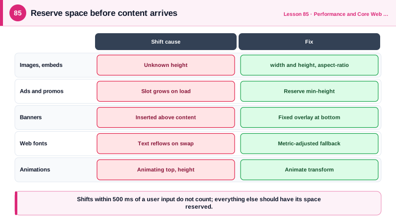
Images and videos without dimensions are the classic cause. Before the image loads, the browser does not know its height, so it allocates zero space and pushes everything down when the image arrives. Adding width and height attributes lets the browser compute the aspect ratio from the start (Day 17); CSS aspect-ratio does the same for elements such as video embeds and iframes. Responsive CSS with height auto keeps the image fluid while preserving the reserved ratio.
Dynamically injected content is the second cause: cookie banners, promotional bars, ads and embeds inserted above existing content, and content rendered after a data request completes. Reserve space for slots whose size is known, such as an ad slot with a min-height matching its most likely size, use skeletons with the final dimensions, and place notifications in overlays that do not push content, such as fixed or sticky positioned banners at the bottom, toasts or dialogs. Never insert content above what the user is reading unless they asked for it; inserting it in response to a click is fine, because shifts within 500 milliseconds of input do not count.
Web fonts cause shifts when the fallback font and the web font have different metrics, so text reflows when the web font arrives. Options include preloading critical fonts so they arrive before first render, using font-display: optional, which uses the web font only if it is available almost immediately, and, most effectively, adjusting the fallback font's metrics with the size-adjust, ascent-override, descent-override and line-gap-override descriptors so it occupies the same space as the web font. Frameworks such as Next.js generate these adjusted fallbacks automatically.
Animations shift layout when they change geometry properties such as top, height or margin. Animations using transform do not count as layout shifts, so animate transform and opacity instead (Day 8). Other sources include back and forward cache restores without dimensions, late-loading CSS that changes layout, and lazy loaded content above the fold. To debug, enable layout shift regions in the DevTools Rendering panel, which flashes shifted areas, check the Performance panel's layout shifts track, which identifies the moved nodes, and use RUM attribution's largestShiftTarget from Day 81 to find shifts that only occur in the field, for example after ads load.
| Cause | Symptom | Fix |
|---|---|---|
| Images without dimensions | Content jumps when images load | width and height, or aspect-ratio |
| Embeds and iframes | Video or map pushes text down | aspect-ratio or fixed container size |
| Ads and promos | Slot expands after load | Reserve min-height for the slot |
| Banners inserted at top | Page content pushed down | Overlay or bottom-anchored, fixed position |
| Data-loaded content | Skeleton smaller than content | Skeletons with final dimensions |
| Web fonts | Text reflows on font swap | Preload, font-display optional, metric overrides |
| Geometry animations | Elements move each frame | Animate transform instead |
Worked Example: Fixing Image, Ad, Banner and Font Shifts
Each rule reserves space or removes the shift at its source. The adjusted fallback font makes the swap to the web font invisible.
/* 1. Images and embeds keep their aspect ratio before loading */
img, video { max-width: 100%; height: auto; }        /* with width and height attributes in HTML */
.video-embed { aspect-ratio: 16 / 9; width: 100%; }

/* 2. Ad slot reserves its most likely height */
.ad-slot--leaderboard { min-height: 90px; contain: layout; }
@media (width < 48rem) { .ad-slot--leaderboard { min-height: 100px; } }

/* 3. Cookie banner overlays content instead of pushing it */
.cookie-banner { position: fixed; inset: auto 0 0 0; z-index: 50; }

/* 4. Skeleton matches the final card size */
.review-skeleton { height: 112px; border-radius: 8px; background: var(--skeleton); }

/* 5. Fallback font adjusted to match the web font's metrics */
@font-face {
  font-family: 'Inter Fallback';
  src: local('Arial');
  size-adjust: 107%;
  ascent-override: 90%;
  descent-override: 22%;
  line-gap-override: 0%;
}
@font-face {
  font-family: 'Inter';
  src: url('/fonts/inter-var.woff2') format('woff2');
  font-display: swap;
}
body { font-family: 'Inter', 'Inter Fallback', sans-serif; }

/* 6. Animate transform, not top, for a sliding notice */
.notice { transform: translateY(-100%); transition: transform 200ms ease-out; }
.notice.is-visible { transform: translateY(0); }<img src="/team.jpg" width="1200" height="800" alt="The support team" loading="lazy">
<div class="video-embed"><iframe src="https://www.youtube-nocookie.com/embed/abc" title="Product demo" loading="lazy"></iframe></div>Turning on layout shift regions in the Rendering panel and reloading with a throttled network shows blue flashes where content moved before the fixes and none after.
Real-World Examples
- Yahoo! JAPAN News reported on web.dev that fixing layout shifts reduced its CLS by 0.2 and was associated with 15 percent more page views per session, 13 percent longer session duration and a lower bounce rate.
- Next.js's font module and the Fontaine and Capsize projects generate fallback font faces with size-adjust and ascent and descent overrides automatically, an approach based on the CSS font metric override descriptors that browsers added to eliminate font swap layout shifts.
Review Questions & Answers
Until the image downloads, the browser does not know its height and reserves no space. When it loads, the image takes its full height and pushes the content below it down. Width and height attributes let the browser compute the aspect ratio and reserve space from the start.
Shifts that happen within 500 milliseconds after a discrete user input are excluded from CLS, because users expect the page to change in response to their actions, such as expanding an accordion.
Text is first rendered in a fallback font and re-laid out when the web font loads; if the fonts have different widths and heights, lines rewrap and content moves. size-adjust and ascent, descent and line gap overrides make the fallback occupy the same space as the web font, so the swap does not move anything.
As an overlay that does not push existing content, for example fixed to the bottom of the viewport or as a dialog, rather than inserted at the top of the document flow above the page content.