Semantic HTML Explained: Landmarks and Headings
On this page
Learning Objective
Choose HTML elements for what content is rather than how it looks, structure pages with landmarks and a logical heading outline, and understand how semantics feed assistive technology, search engines, reader modes and your own CSS and tests.
Concept Explanation
HTML elements carry meaning. A button is something you activate, a link is something that navigates, a nav element contains navigation, and an h2 starts a section under an h1. Browsers expose that meaning to the accessibility tree (Day 13), search engines use it to understand content, reader modes use it to extract articles, and testing libraries use it to find elements the way users do. A page built entirely from div and span elements can look identical, but it throws all of that away.
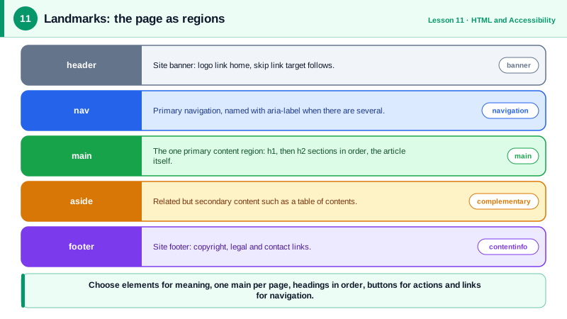
Landmarks are the large regions of a page: header, nav, main, aside and footer, plus section and form when they have an accessible name. Screen reader users can jump directly between landmarks, the way sighted users glance at a layout. There should be exactly one main element per page, holding the primary content, so a skip link and the landmark menu can take users straight past repeated navigation. A header or footer directly inside body becomes the site banner or contentinfo landmark; inside an article it is just the header of that article.
Headings form the outline of the page. Screen reader users frequently navigate by heading, and a survey by WebAIM found it is the most common way they look for information on a long page. Use one h1 for the page's main topic, then nest h2 to h6 without skipping levels for style. If you want a small heading, choose the right level and style it with CSS; never pick a heading level for its default size. Conversely, do not use a heading element just to make text bold.
Many semantic elements bring behavior for free. A button is focusable, activates with Enter and Space, and submits forms by default (so set type="button" when it should not). A link with an href is focusable, opens in a new tab with a modifier key and shows its destination. The time element gives machines a datetime. The figure and figcaption pair associates a caption with an image or code sample. Lists announce their length, tables with th and caption announce row and column headers. Recreating any of this with div elements requires ARIA roles, tabindex, keyboard handlers and still usually misses something.
The rule of thumb is to ask what a thing is, not what it looks like. If it navigates to a URL, it is a link even if it looks like a button. If it performs an action on the page, it is a button even if it looks like a link. If it is a list of products, it is a list. Styling is CSS's job, and semantics are HTML's.
| Element | Meaning | What you get for free |
|---|---|---|
| main | The primary content, one per page | Landmark navigation, skip target |
| nav | A block of navigation links | Landmark, named with aria-label if several |
| h1 to h6 | Section headings in order | Heading navigation and page outline |
| button | An action on this page | Focus, Enter and Space, form submit |
| a with href | Navigation to a URL | Focus, open in new tab, status bar URL |
| ul, ol, li | A list of items | Item count announced |
| table, th, caption | Tabular data | Header cells announced with each cell |
| time | A date or time | Machine-readable datetime attribute |
Worked Example: Rewriting a Div-Based Article Page
The first version renders correctly but exposes nothing useful to assistive technology. The second keeps the same visual design with CSS and adds structure.
<!-- Before: no landmarks, fake headings, a div pretending to be a button -->
<div class="top"><div class="logo">Acme</div><div class="links">...</div></div>
<div class="content">
<div class="title">Choosing a laptop</div>
<div class="date">March 3, 2026</div>
<div class="big">Battery life</div>
<p>...</p>
<div class="btn" onclick="share()">Share</div>
</div>
<!-- After: same look, real structure -->
<a class="skip-link" href="#main">Skip to content</a>
<header>
<a href="/" class="logo">Acme</a>
<nav aria-label="Primary">
<ul><li><a href="/guides">Guides</a></li><li><a href="/deals">Deals</a></li></ul>
</nav>
</header>
<main id="main">
<article>
<header>
<h1>Choosing a laptop</h1>
<p>Published <time datetime="2026-03-03">March 3, 2026</time></p>
</header>
<h2>Battery life</h2>
<p>...</p>
<button type="button" class="btn" onclick="share()">Share</button>
</article>
</main>
<footer><p>© 2026 Acme</p></footer>/* Visual styling stays independent of semantics */
.skip-link { position: absolute; left: -9999px; }
.skip-link:focus { left: 1rem; top: 1rem; }
h2 { font-size: 1.25rem; } /* small heading, correct level */Open the accessibility tree in DevTools for both versions: the first shows generic containers and text, the second shows banner, navigation, main and contentinfo landmarks, a heading hierarchy and a button that keyboard users can reach and activate.
Real-World Examples
- WebAIM's recurring Screen Reader User Survey consistently finds that navigating by headings is the most common way screen reader users find information on a lengthy web page, which makes a correct heading outline one of the highest value accessibility fixes.
- The WebAIM Million report, which analyzes the home pages of the top one million websites each year, regularly lists missing form labels, empty links and empty buttons among the most common detected failures, all problems that native semantic elements with proper text prevent.
Review Questions & Answers
Heading levels define the document outline that screen reader users navigate and that search engines read. Choosing h4 because it looks small, or skipping from h1 to h4, produces a broken outline. The correct level should be chosen for structure and the size controlled with CSS.
Ask what happens on activation. If it navigates to a URL, including a different route in a single page app, use a link with an href. If it performs an action on the current page, such as opening a dialog, submitting or toggling, use a button.
It marks the primary content of the page as the main landmark, so assistive technology users can jump straight to it, and it is the natural target of a skip link. There should be only one visible main element per page.
It is in the tab order, activates with both Enter and Space, exposes the button role and its label to assistive technology, can be disabled properly and participates in form submission. A div needs a role, tabindex, keyboard handlers and state management to approximate the same behavior.