CSS Variables and Dark Mode Theming
On this page
Learning Objective
Use CSS custom properties as live, inherited variables: define and override them at any level, provide fallbacks, register typed properties with @property, build a token-based theme with light and dark modes and a user toggle, and update properties from JavaScript.
Concept Explanation
Custom properties, often called CSS variables, are properties whose names start with two dashes, such as --brand. You define them like any other declaration and read them with the var() function. Unlike variables in preprocessors such as Sass, which are replaced at build time, custom properties live in the browser. They cascade and inherit like normal properties, can be changed by media queries, classes or JavaScript at run time, and every element that uses them updates automatically.
Inheritance is what makes them powerful. A value defined on :root is available everywhere. A value redefined on a component or section applies to that subtree only. This lets a single component read var(--card-bg) and look different inside a promotional section that redefines it, without any extra classes on the component. var() accepts a fallback, var(--card-bg, white), used when the property is not defined; fallbacks can nest, which helps components that expose their own variables but default to the global theme.
By default a custom property is untyped: its value is just a sequence of tokens, substituted when used. That has two consequences. Invalid values are only detected when the property is used, at which point the declaration that uses it becomes invalid at computed value time and falls back to inherit or initial rather than to an earlier declaration. And untyped properties cannot be animated smoothly, because the browser does not know how to interpolate them. The @property rule registers a property with a syntax such as color, length or percentage, an initial value and whether it inherits. Registered properties are type-checked and can be transitioned, which enables effects such as animating a gradient's angle.
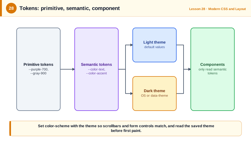
Theming is the most common use. A good system has two levels of tokens. Primitive tokens name raw values, such as --purple-700. Semantic tokens describe purpose, such as --color-text, --color-surface and --color-accent, and components only use semantic tokens. A dark theme then redefines only the semantic tokens, either automatically with prefers-color-scheme or explicitly with a data attribute on the root element when the user picks a theme. The color-scheme property tells the browser to render built-in UI, such as scrollbars and form controls, in matching colors, and the light-dark() function lets a single declaration provide both values.
From JavaScript, element.style.setProperty('--x', value) updates a property, and getComputedStyle(el).getPropertyValue('--x') reads it. Updating one custom property on the root is a cheap way to change many styles at once, such as a user-selected accent color, though changing a property high in the tree recalculates styles for everything that inherits it.
| Feature | Syntax | Note |
|---|---|---|
| Define | --brand: #6b21a8; | Any selector, usually :root |
| Use with fallback | color: var(--brand, purple) | Fallback when undefined |
| Scope | .promo { --card-bg: #faf5ff; } | Applies to that subtree |
| Typed registration | @property --angle { syntax: '<angle>'; ... } | Validation and animation |
| Built-in UI colors | color-scheme: light dark | Scrollbars and form controls |
| Two values in one | light-dark(#111, #eee) | Picks by the used color scheme |
| JavaScript | style.setProperty('--x', '10px') | Runtime theming |
Worked Example: Semantic Tokens with System, Light and Dark Themes
The theme follows the operating system by default and lets users override it. Components only use semantic tokens, so they need no theme-specific code.
:root {
  /* Primitive tokens */
  --purple-700: #6b21a8; --purple-300: #d8b4fe;
  --gray-900: #111827;   --gray-50: #f9fafb;   --gray-600: #4b5563; --gray-300: #d1d5db;

  /* Semantic tokens: light by default */
  color-scheme: light;
  --color-surface: #ffffff;
  --color-text: var(--gray-900);
  --color-muted: var(--gray-600);
  --color-accent: var(--purple-700);
}

/* Follow the OS unless the user picked a theme */
@media (prefers-color-scheme: dark) {
  :root:not([data-theme="light"]) {
    color-scheme: dark;
    --color-surface: var(--gray-900);
    --color-text: var(--gray-50);
    --color-muted: var(--gray-300);
    --color-accent: var(--purple-300);
  }
}
:root[data-theme="dark"] {
  color-scheme: dark;
  --color-surface: var(--gray-900);
  --color-text: var(--gray-50);
  --color-muted: var(--gray-300);
  --color-accent: var(--purple-300);
}

body { background: var(--color-surface); color: var(--color-text); }
.button { background: var(--color-accent); color: var(--color-surface); }

/* A typed property can be animated */
@property --angle { syntax: '<angle>'; initial-value: 0deg; inherits: false; }
.spinner { background: conic-gradient(from var(--angle), var(--color-accent), transparent); animation: spin 1s linear infinite; }
@keyframes spin { to { --angle: 360deg; } }const toggle = document.querySelector('#theme');
toggle.addEventListener('change', () => {
const value = toggle.value; // 'system' | 'light' | 'dark'
if (value === 'system') document.documentElement.removeAttribute('data-theme');
else document.documentElement.dataset.theme = value;
try { localStorage.setItem('theme', value); } catch {}
});Read the stored theme in a small inline script in the head, before the stylesheet renders the page, so users with a saved dark theme do not see a flash of the light theme on load.
Real-World Examples
- GitHub's Primer design system ships its color themes, including light, dark, dimmed and high contrast variants, as CSS custom properties with semantic names such as foreground, background and border colors, so components switch themes without code changes.
- The @property rule from the CSS Properties and Values API reached all major browsers when Firefox 128 added support in 2024, making typed, animatable custom properties usable without fallbacks for most audiences.
Review Questions & Answers
Sass variables are replaced with values at build time and do not exist in the browser. Custom properties exist at run time, cascade and inherit through the DOM, can be scoped to subtrees and changed by media queries or JavaScript, and every usage updates automatically.
A semantic token such as --color-text describes purpose, so a theme can map it to a different primitive value in dark mode or high contrast mode. If components used --gray-900 directly, every component would need theme-specific overrides.
The browser knows its type, so invalid values are rejected at parse time instead of failing at use, the property gets a defined initial value and inheritance behavior, and transitions and animations can interpolate it smoothly, for example animating an angle or a color stored in a variable.
It tells the browser that the page supports a dark scheme, so it renders built-in UI such as scrollbars, form controls and the default canvas in dark colors, and it determines which value light-dark() returns.