React Compound Components and Headless UI Patterns
On this page
Learning Objective
Design flexible, accessible components with advanced patterns: compound components that share implicit state through context, headless components and hooks that provide behavior without markup, slot and asChild patterns for composition, and choose between these patterns and configuration props for a design system.
Concept Explanation
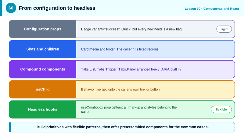
Basic components serve basic needs, but design systems face a harder problem: one Tabs, Select or Menu component must serve dozens of products with different layouts, styles and content, while staying accessible. Adding a prop for every variation produces the flag explosion of Day 52. Several patterns let components be flexible without growing endless configuration.
Compound components split one widget into cooperating parts that the consumer arranges: Tabs, Tabs.List, Tabs.Trigger and Tabs.Panel, much like the native select and option elements. The parent holds state and shares it with its parts through context, so the consumer never wires state between them, yet controls the structure fully: triggers can be placed in a sidebar, panels can be wrapped in animation components, extra elements can go anywhere. The parts handle the accessibility contract internally, generating ids, roles, aria-selected, aria-controls and keyboard behavior, so every consumer gets it right automatically.
Headless components take separation further: they provide behavior, state and accessibility but no styles and sometimes no markup at all. A headless hook such as useCombobox returns state and prop getters, functions that return the attributes and handlers an element needs, like getInputProps and getItemProps. The consumer spreads them onto its own elements and styles them however it likes. Libraries such as React Aria, Downshift, Headless UI, Radix Primitives and TanStack Table follow this approach, which is why so many design systems build their visual layer on top of them rather than reimplementing focus management and keyboard handling.
Slots and asChild solve a related problem: letting a consumer choose the rendered element while keeping the component's behavior. A Button that must sometimes be a link, or a Dialog.Trigger that should be the consumer's own button, can accept an asChild prop that merges its props and behavior onto its single child element instead of rendering its own. Named slot props, like the media and footer of Day 52, provide regions for content. These patterns keep semantics correct: a navigation action stays an anchor, an action stays a button.
Patterns have costs. Compound components and headless hooks are more flexible but more verbose to use, and their implicit context coupling means parts only work inside their parent. A simple component used the same way everywhere, such as a Badge, should just take props. A good design system offers both levels: low-level primitives built with these patterns for flexibility, and preassembled components for the common cases, built from those primitives.
| Pattern | What the consumer controls | Example |
|---|---|---|
| Configuration props | Only predefined options | Badge variant="success" |
| Composition with children and slots | Content of fixed regions | Card media and footer |
| Compound components | Structure and order of parts | Tabs.List, Tabs.Trigger, Tabs.Panel |
| Headless hook with prop getters | All markup and styles | useCombobox getInputProps |
| asChild | The rendered element | Trigger rendered as your own link |
| Preassembled component | Little, but quick to use | A ready-made SearchSelect |
Worked Example: Compound Tabs with Built-in Accessibility
The Tabs parts share state through context. Consumers arrange the parts freely, while ids, roles, selection and arrow-key behavior are handled inside.
type TabsCtx = { value: string; setValue: (v: string) => void; baseId: string };
const TabsContext = createContext<TabsCtx | null>(null);
const useTabs = () => {
  const ctx = useContext(TabsContext);
  if (!ctx) throw new Error('Tabs parts must be used inside <Tabs>');
  return ctx;
};

function Tabs({ defaultValue, children }: { defaultValue: string; children: React.ReactNode }) {
  const [value, setValue] = useState(defaultValue);
  const baseId = useId();
  return <TabsContext.Provider value={{ value, setValue, baseId }}>{children}</TabsContext.Provider>;
}

function List({ label, children }: { label: string; children: React.ReactNode }) {
  const onKeyDown = (e: React.KeyboardEvent<HTMLDivElement>) => {
    const tabs = [...e.currentTarget.querySelectorAll<HTMLButtonElement>('[role="tab"]')];
    const i = tabs.indexOf(document.activeElement as HTMLButtonElement);
    const next = { ArrowRight: i + 1, ArrowLeft: i - 1, Home: 0, End: tabs.length - 1 }[e.key];
    if (next === undefined || i < 0) return;
    e.preventDefault();
    tabs[(next + tabs.length) % tabs.length].click();
    tabs[(next + tabs.length) % tabs.length].focus();
  };
  return <div role="tablist" aria-label={label} onKeyDown={onKeyDown}>{children}</div>;
}

function Trigger({ value, children }: { value: string; children: React.ReactNode }) {
  const { value: selected, setValue, baseId } = useTabs();
  const isSelected = value === selected;
  return (
    <button role="tab" type="button" id={`${baseId}-tab-${value}`} aria-controls={`${baseId}-panel-${value}`}
            aria-selected={isSelected} tabIndex={isSelected ? 0 : -1} onClick={() => setValue(value)}>
      {children}
    </button>
  );
}

function Panel({ value, children }: { value: string; children: React.ReactNode }) {
  const { value: selected, baseId } = useTabs();
  return (
    <div role="tabpanel" id={`${baseId}-panel-${value}`} aria-labelledby={`${baseId}-tab-${value}`}
         hidden={value !== selected} tabIndex={0}>
      {children}
    </div>
  );
}

Tabs.List = List; Tabs.Trigger = Trigger; Tabs.Panel = Panel;

// Consumers arrange parts freely and add their own elements
<Tabs defaultValue="profile">
  <header className="settings-header">
    <h2>Settings</h2>
    <Tabs.List label="Settings sections">
      <Tabs.Trigger value="profile">Profile</Tabs.Trigger>
      <Tabs.Trigger value="security">Security <Badge>1</Badge></Tabs.Trigger>
    </Tabs.List>
  </header>
  <Tabs.Panel value="profile"><ProfileForm /></Tabs.Panel>
  <Tabs.Panel value="security"><SecuritySettings /></Tabs.Panel>
</Tabs>;
The consumer placed the tab list inside its own header with a heading and a badge, something a configuration-driven Tabs component would have needed new props for. The ARIA wiring from Day 15 is identical in every use because it lives in the parts.
Real-World Examples
- Radix UI Primitives and shadcn/ui, one of the most widely adopted React component collections, are built almost entirely from compound components with an asChild option, and shadcn/ui copies the styled components into each project so teams own and adapt the code.
- Adobe's React Aria provides headless hooks and components that implement the ARIA Authoring Practices patterns with internationalization and cross-device interactions, and is used as the behavior layer under Adobe's own Spectrum design system.
Review Questions & Answers
The parent component holds the state and provides it through context. Each part reads the context, so the consumer only arranges the parts in JSX while the parent and parts coordinate implicitly.
A component or hook that provides behavior, state and accessibility, such as keyboard handling and ARIA attributes, without imposing markup or styles. It typically returns state and prop getter functions that the consumer spreads onto its own elements.
It lets a component apply its behavior and props to an element the consumer chooses, such as rendering a trigger as the consumer's own link or button, without wrapping it in an extra element and without breaking semantics.
For small components used in essentially the same way everywhere, such as a badge, spinner or avatar, where a few variant props cover all needs. Advanced patterns add verbosity and coupling that only pay off when consumers need real structural flexibility.