Keyboard Accessibility and Focus Management
On this page
Learning Objective
Make every interactive feature usable with a keyboard alone: keep a logical tab order, show a visible focus indicator, use tabindex correctly, move focus deliberately when content appears or routes change, and contain focus inside modal content without trapping users elsewhere.
Concept Explanation
Many people never use a mouse: screen reader users, people with motor impairments who use a keyboard or switch device, and power users who simply prefer it. For them, focus is the cursor. Only one element has focus at a time, Tab moves forward through focusable elements, Shift and Tab moves back, Enter and Space activate, Escape dismisses, and arrow keys move within composite widgets such as menus, tabs and listboxes. If something can be done with a pointer, it must be possible with the keyboard.
Tab order follows DOM order by default. That is why source order matters: if CSS such as flex order, grid placement or absolute positioning moves things visually, focus can jump around the screen in a confusing way. Fix the DOM order rather than fighting it. tabindex has three useful forms. tabindex="0" adds a non-native element to the natural tab order, which you need for custom widgets. tabindex="-1" makes an element focusable by script but not by Tab, which is ideal for headings or containers you want to move focus to. Positive values force an explicit order that overrides the DOM and almost always creates a mess, so avoid them.
Users must be able to see where focus is. Removing the outline without a replacement is one of the most damaging and common accessibility mistakes. The :focus-visible pseudo-class solves the old design complaint: browsers apply it when focus should be visible, typically for keyboard navigation, and not for mouse clicks on buttons. Style :focus-visible with a high-contrast outline and an offset, and keep it visible against every background.
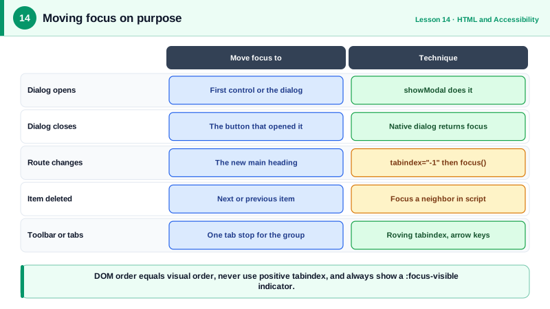
Focus management means moving focus on purpose when the interface changes. Open a dialog, and focus should move into it; close it, and focus should return to the button that opened it. Delete an item from a list, and focus should go to a sensible neighbor rather than falling back to the top of the page. In a single page app, changing routes does not reset focus as a full page load does, so move focus to the new page's main heading and update the document title. The inert attribute is the modern tool for modal situations: marking the rest of the page inert removes it from focus and the accessibility tree, so focus stays in the dialog naturally. The native dialog element opened with showModal does this for you (Day 19).
Composite widgets use a roving tabindex: only one item in the group has tabindex="0" and the rest have -1. Tab enters and leaves the group in one step, and arrow keys move focus within it. That keeps the tab sequence short on pages with toolbars and tab lists, which matches how native radio groups and select elements behave.
| Technique | When to use it | Note |
|---|---|---|
| DOM order matches visual order | Always | Do not rely on CSS reordering |
| tabindex="0" | Custom interactive element | Prefer a native element instead |
| tabindex="-1" | Focus target for script | Headings, dialog containers |
| Positive tabindex | Never | Breaks the natural order |
| :focus-visible outline | Every focusable element | Never remove outlines without replacement |
| Return focus on close | Dialogs, menus, popovers | Back to the invoking control |
| inert | Background behind modal content | Removes it from focus and the tree |
| Roving tabindex | Toolbars, tabs, grids | Tab enters once, arrows move inside |
Worked Example: Focus After Route Changes and a Roving Tab Toolbar
Two common cases: resetting focus after a client-side navigation, and a toolbar where arrow keys move between buttons.
// 1. After a client-side route change, move focus to the new heading.
function onRouteChange(title) {
  document.title = `${title} | Acme`;
  const h1 = document.querySelector('main h1');
  h1.setAttribute('tabindex', '-1');                 // focusable by script only
  h1.focus({ preventScroll: false });                // screen readers announce the new page
}

// 2. Roving tabindex toolbar: one tab stop, arrows move within.
const toolbar = document.querySelector('[role="toolbar"]');
const buttons = [...toolbar.querySelectorAll('button')];
buttons.forEach((b, i) => b.tabIndex = i === 0 ? 0 : -1);

toolbar.addEventListener('keydown', (e) => {
  const i = buttons.indexOf(document.activeElement);
  if (i < 0) return;
  const next = { ArrowRight: i + 1, ArrowLeft: i - 1, Home: 0, End: buttons.length - 1 }[e.key];
  if (next === undefined) return;
  e.preventDefault();
  const target = buttons[(next + buttons.length) % buttons.length];
  buttons[i].tabIndex = -1;
  target.tabIndex = 0;
  target.focus();
});/* A visible, consistent focus style for keyboard users */
:focus-visible {
outline: 3px solid #6b21a8;
outline-offset: 2px;
}
.skip-link:focus-visible { outline-color: #fff; }Test by unplugging the mouse: tab through the page, confirm the order matches the reading order, check that the focus ring is always visible, and confirm that after navigating, the screen reader announces the new page's heading.
Real-World Examples
- WCAG 2.2 added success criterion 2.4.11 Focus Not Obscured, which requires that a focused element is not entirely hidden by sticky headers, cookie banners or other author-created content, a frequent problem on sites with fixed toolbars.
- In 2019 Gatsby ran user research with Fable Tech Labs on accessible client-side routing, testing screen reader, voice control and magnification users; the findings led Gatsby to announce route changes and manage focus after navigation, and Next.js later shipped a similar built-in route announcer.
Review Questions & Answers
Tab order follows the DOM, not the visual layout. If CSS moves elements visually, keyboard focus jumps in an order that does not match what users see, which is disorienting and can make forms or toolbars hard to use. The DOM order should be fixed to match the visual order.
tabindex="0" puts an element into the natural tab order at its DOM position. tabindex="-1" makes an element focusable with script, through focus(), but leaves it out of the Tab sequence, which suits headings or containers you move focus to programmatically.
Focus should move to a meaningful place in the new content, usually the main heading made focusable with tabindex -1, and the document title should be updated. Otherwise focus stays on the link that was activated, or is lost, and screen reader users are not told the page changed.
In a group such as a toolbar or tab list, making every item tabbable would force users to press Tab many times to get past it. With a roving tabindex only one item is in the tab order, Tab moves in and out of the group in one step, and arrow keys move focus within it.