CSS Flexbox Tutorial: flex-grow, shrink, basis
On this page
Learning Objective
Lay out items along one axis with flexbox: control direction and wrapping, distribute free space with flex-grow, flex-shrink and flex-basis, align on the main and cross axes, and fix the common min-width auto overflow problem, choosing flexbox where content should drive size.
Concept Explanation
Flexbox lays out a container's children, the flex items, along a single axis. The main axis follows flex-direction: row runs horizontally in the writing direction and column runs vertically. The cross axis is perpendicular. Most flexbox properties are about these two axes: justify-content distributes items along the main axis, and align-items aligns them on the cross axis. Because the axes swap when you change direction, thinking in main and cross rather than horizontal and vertical avoids confusion.
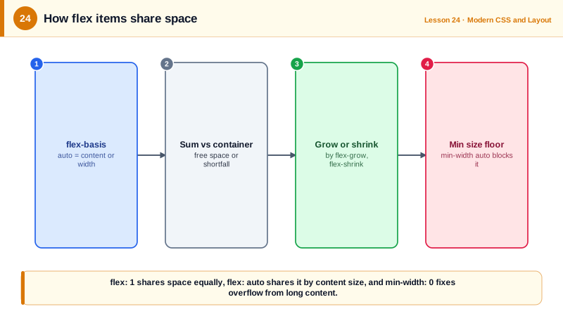
The heart of flexbox is how it shares space. Each item starts at its flex-basis, which defaults to auto, meaning its width or content size. The browser adds up the bases and compares the total to the container. If there is leftover space, items grow in proportion to their flex-grow values; if there is not enough, they shrink in proportion to flex-shrink weighted by their basis. The shorthand flex: 1 means grow 1, shrink 1, basis 0, so items share all the space equally regardless of content. flex: auto means grow and shrink from the content size, so bigger content gets bigger items. flex: none makes an item rigid.
Wrapping turns one line into several. With flex-wrap: wrap, items that do not fit move to a new line, and each line is laid out independently, so items on the last line may stretch differently than those above. align-content then distributes the lines themselves in the cross axis. When you need items in rows to line up as columns across lines, you have outgrown flexbox and need grid.
A notorious flexbox bug comes from minimum sizes. Flex items have min-width: auto by default in a row, which means they will not shrink below their content's minimum size. A long URL, a wide table or a code block inside a flex item then forces the item, and the whole layout, wider than the screen. The fix is min-width: 0 on the item, or overflow hidden, so the item can shrink and its content can wrap or scroll. The same applies to min-height in columns.
Flexbox excels when content should determine size: navigation bars, toolbars, button groups, form rows with a label and an input, media objects with an image and text, and centering. gap provides spacing between items without margin hacks. margin-left: auto on one item pushes it, and everything after it, to the far end, a simple way to put a sign-in button at the right of a nav bar.
| Property | Axis or target | Common values |
|---|---|---|
| flex-direction | Sets the main axis | row, column |
| justify-content | Main axis distribution | flex-start, center, space-between |
| align-items | Cross axis alignment | stretch, center, baseline |
| flex-wrap | Allow multiple lines | nowrap, wrap |
| flex-grow, flex-shrink, flex-basis | How an item shares space | flex: 1, flex: auto, flex: none |
| gap | Space between items | gap: 1rem |
| min-width: 0 | Lets items shrink below content | Fixes overflow from long content |
| margin-inline-start: auto | Pushes an item to the end | Sign-in button at the right |
Worked Example: A Responsive Toolbar and a Media Object
The toolbar shares space, pushes actions to the end and wraps on narrow screens. The media object shows the min-width fix.
<nav class="toolbar">
  <a class="brand" href="/">Acme</a>
  <input class="search" type="search" placeholder="Search" aria-label="Search">
  <div class="actions"><button>Help</button><button>Sign in</button></div>
</nav>

<article class="media">
  <img src="/avatar.png" alt="" width="48" height="48">
  <div class="body">
    <p>Deployed to https://very-long-preview-url.example.com/branches/feature/super-long-branch-name</p>
  </div>
</article>.toolbar {
display: flex;
align-items: center; /* cross axis */
flex-wrap: wrap;
gap: 0.75rem;
}
.brand { flex: none; } /* never grows or shrinks */
.search { flex: 1 1 16rem; } /* grows to fill, prefers 16rem, may shrink */
.actions {
display: flex; gap: 0.5rem;
margin-inline-start: auto; /* pushed to the end of the line */
}
.media { display: flex; gap: 1rem; align-items: flex-start; }
.media img { flex: none; }
.media .body {
flex: 1;
min-width: 0; /* without this the long URL forces horizontal overflow */
}
.media .body p { overflow-wrap: anywhere; }Remove min-width: 0 and narrow the window: the media object refuses to shrink below the URL's width and the page scrolls sideways. Add it back and the URL wraps inside the body as intended.
Real-World Examples
- Philip Walton's "Solved by Flexbox" project demonstrated how flexbox replaced fragile float and table hacks for problems such as sticky footers, equal-height columns, vertical centering and input add-ons, and these became standard patterns in frameworks like Bootstrap 4 and later.
- The CSS Working Group's flexbox specification documents the automatic minimum size of flex items, and the min-width: 0 fix is one of the most frequently cited answers on Stack Overflow for overflowing flex layouts with long text or code.
Review Questions & Answers
flex: 1 sets flex-basis to 0, so all free space is shared in proportion to flex-grow and items with equal grow values become equal in size regardless of content. flex: auto uses the content size as the basis and then shares the remaining space, so items with more content end up larger.
Flex items default to min-width auto, which prevents them from shrinking below their content's minimum width, and an unbreakable URL has a large minimum width. Setting min-width: 0 on the item lets it shrink, and overflow-wrap: anywhere lets the text break.
Give it margin-inline-start: auto, or margin-left: auto in a left-to-right layout. The auto margin absorbs all free space on that side, pushing the item and any items after it to the end.
When items need to align in two dimensions at once, for example when cards on different rows should line up in columns, or when the layout is defined by the container's tracks rather than by the content of each item.