CSS Grid Tutorial: auto-fill, minmax and Subgrid
On this page
Learning Objective
Define grid tracks with fr units, minmax, repeat, auto-fill and auto-fit, place items by line numbers and named areas, build intrinsically responsive layouts without media queries, and use subgrid to align nested content across components.
Concept Explanation
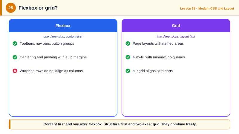
CSS Grid lays out items in two dimensions at once. You define tracks, the rows and columns, on the container, and items either flow into the cells automatically or are placed explicitly. Where flexbox lets content push its way to a size, grid lets the container define a structure that content fits into. That makes it the natural tool for page layouts, card galleries, forms with aligned labels and any design that is really a table of regions.
Tracks are sized with familiar units plus a few grid-specific ones. The fr unit means a fraction of the free space, so 1fr 2fr gives the second column twice the remaining space of the first. minmax(min, max) lets a track grow and shrink between bounds. repeat avoids repetition. The famous pattern repeat(auto-fill, minmax(16rem, 1fr)) creates as many columns as fit, each at least 16rem, stretching to fill the row, so a card grid becomes responsive with no media queries at all. auto-fit behaves the same except that empty tracks collapse, so a few items stretch to fill the row instead of leaving empty columns. Writing minmax(min(16rem, 100%), 1fr) prevents overflow on screens narrower than the minimum.
Placement can be numeric or named. Grid lines are numbered from 1, and negative numbers count from the end, so grid-column: 1 / -1 spans the full width. Named areas are often clearer: grid-template-areas draws the layout as a set of strings, and items take a name with grid-area. Rearranging the layout for a different breakpoint is then a matter of redrawing the strings, though remember from Day 14 that visual reordering must not contradict the DOM's reading order.
Implicit tracks are created when items are placed outside the defined grid or when there are more items than cells; grid-auto-rows sizes them, and grid-auto-flow: dense lets the browser backfill gaps with later items, which again can disturb reading order. Alignment works as in flexbox, with justify-items and align-items aligning items within their cells and justify-content and align-content aligning the whole grid in its container. gap sets row and column gutters.
Subgrid solves a long-standing problem: aligning things inside nested components. A card is a grid item, but its title, body and footer live in their own box, so card footers on the same row do not line up when titles have different lengths. With grid-template-rows: subgrid, the card adopts the parent grid's row tracks for its children, so every title row, body row and footer row aligns across cards. Subgrid is supported in all major browsers since 2023.
| Feature | Syntax | Use |
|---|---|---|
| Fraction of free space | grid-template-columns: 1fr 2fr | Proportional columns |
| Bounded tracks | minmax(12rem, 1fr) | Grow and shrink within limits |
| Fill the row | repeat(auto-fill, minmax(16rem, 1fr)) | Responsive card grids |
| Collapse empty tracks | repeat(auto-fit, ...) | Few items stretch to fill |
| Line placement | grid-column: 1 / -1 | Full-width items |
| Named areas | grid-template-areas and grid-area | Readable page layouts |
| Nested alignment | grid-template-rows: subgrid | Align card parts across cards |
Worked Example: A Page Layout and an Aligned Card Gallery
The page uses named areas that change at one breakpoint. The gallery is responsive without media queries and uses subgrid to align card footers.
.page {
  display: grid;
  grid-template-columns: minmax(0, 1fr);
  grid-template-areas:
    "header"
    "main"
    "sidebar"
    "footer";
  gap: 1.5rem;
}
@media (min-width: 64rem) {
  .page {
    grid-template-columns: 16rem minmax(0, 1fr);
    grid-template-areas:
      "header  header"
      "sidebar main"
      "footer  footer";
  }
}
.page > header { grid-area: header; }
.page > main   { grid-area: main; }
.page > aside  { grid-area: sidebar; }
.page > footer { grid-area: footer; }

.gallery {
  display: grid;
  grid-template-columns: repeat(auto-fill, minmax(min(16rem, 100%), 1fr));
  gap: 1rem;
}
.card {
  display: grid;
  grid-row: span 3;                       /* occupy three of the gallery's row tracks */
  grid-template-rows: subgrid;            /* title, body and footer rows align across cards */
  gap: 0.5rem;
}
.card .footer { align-self: end; }<class="tok-k">div class="gallery">
<class="tok-k">article class="card"><class="tok-k">h3>Short title</class="tok-k">h3><class="tok-k">p>...</class="tok-k">p><class="tok-k">div class="footer">$20</class="tok-k">div></class="tok-k">article>
<class="tok-k">article class="card"><class="tok-k">h3>A much longer title that wraps</class="tok-k">h3><class="tok-k">p>...</class="tok-k">p><class="tok-k">div class="footer">$35</class="tok-k">div></class="tok-k">article>
</class="tok-k">div>Turn on the grid overlay in DevTools to see the named areas and line numbers. With subgrid, the price rows of cards on the same line align even when titles wrap differently; remove the subgrid line and they drift apart.
Real-World Examples
- CSS Grid shipped in Chrome, Firefox and Safari within a few weeks of each other in March 2017, a coordinated launch that Jen Simmons and Rachel Andrew, who did much of the advocacy and teaching around it, described as a turning point for layout on the web.
- Subgrid arrived in Firefox in 2019, Safari 16 in 2022 and Chrome 117 in 2023, and the Interop project listed it as a focus area, which is why design systems began relying on it for aligned card layouts once all three engines supported it.
Review Questions & Answers
Both create as many tracks as fit in the container. auto-fill keeps empty tracks when there are fewer items than tracks, so items keep their size and leave space. auto-fit collapses empty tracks to zero, so the existing items stretch to fill the row.
If the container is narrower than 16rem, a fixed 16rem minimum forces the track wider than the container and causes horizontal overflow. min(16rem, 100%) lowers the minimum to the container width on very small screens.
Elements inside a grid item, such as a card's title, body and footer, cannot normally align with the corresponding elements of sibling cards because each card has its own internal layout. Subgrid lets the card adopt the parent's tracks, so those inner elements share rows or columns and align across cards.
It places the item from the first column line to the last line, with negative numbers counting from the end, so the item spans the full width of the explicit grid whatever the number of columns.