React Lifting State Up: Controlled vs Uncontrolled
On this page
Learning Objective
Decide which component should own a piece of state, lift state to the closest common parent when siblings must share it, distinguish controlled from uncontrolled components, and design components that support both modes so they can be used simply or controlled from outside.
Concept Explanation
Every piece of state should have exactly one owner, the component that holds it with useState and passes it down to whoever needs it. Duplicating state in two components that must agree is the same mistake as storing derived data: the copies drift. When two sibling components need the same data, for example a filter panel and a results list, neither sibling can own it. The solution is to lift the state up to their closest common parent, which passes the value down to both and passes a callback to the one that changes it. This is often the first refactor a growing component tree needs.
Lifting has a cost: the higher the state, the more components re-render when it changes and the more props must be threaded through intermediate components. So the rule is to lift state only as far as necessary, to the lowest common ancestor of its users, and no further. Colocation and lifting are two sides of the same principle: state lives where it is needed, no lower and no higher.
The same ownership question appears inside individual components as the controlled versus uncontrolled distinction. A controlled component receives its current value from props and reports changes through a callback, so the parent is the source of truth. A native input with value and onChange props is controlled: it displays exactly what the parent's state says. An uncontrolled component keeps its own internal state, optionally initialized from a default prop, and the parent reads it only when needed, such as on submit through a ref or FormData. An input with defaultValue is uncontrolled.
Neither is always better. Controlled components are required when the parent must react to every change: live validation, formatting as the user types, enabling a button based on input, or synchronizing two views. Uncontrolled components are simpler and render less, which suits large forms where values are only needed on submit, and they work with plain form submission and server actions. A common bug is switching between modes, starting with value undefined and later passing a string, which React warns about.
Reusable components can support both modes, which is what design systems do. The pattern is: accept value and onChange for controlled use, accept defaultValue for uncontrolled use, keep internal state only when value is undefined, and always call onChange when the value changes. A small hook can encapsulate this logic so that every component in the library behaves consistently.
| Situation | Approach | Reason |
|---|---|---|
| Two siblings need the same data | Lift state to the common parent | One owner, no drift |
| Only one component uses it | Keep it local | Smaller re-renders |
| Parent reacts to every keystroke | Controlled component | Parent is the source of truth |
| Value needed only on submit | Uncontrolled with defaultValue | Simpler, fewer renders |
| Library component | Support both modes | Flexible for consumers |
| value switches from undefined to defined | Bug | Pick one mode for the lifetime |
Worked Example: Lifting Filter State and a Dual-Mode Toggle
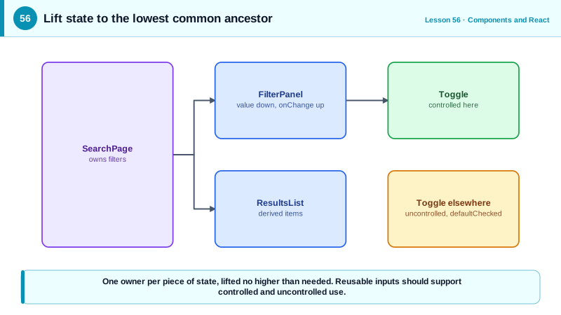
The filter panel and results list share lifted state. The Toggle component works controlled or uncontrolled through a small hook.
// Lifted state: the page owns the filters, both children receive what they need
function SearchPage({ products }: { products: Product[] }) {
  const [filters, setFilters] = useState<Filters>({ q: '', inStockOnly: false });
  const visible = products.filter((p) =>
    p.name.toLowerCase().includes(filters.q.toLowerCase()) && (!filters.inStockOnly || p.stock > 0));

  return (
    <div className="layout">
      <FilterPanel value={filters} onChange={setFilters} />
      <ResultsList items={visible} />
    </div>
  );
}

function FilterPanel({ value, onChange }: { value: Filters; onChange: (f: Filters) => void }) {
  return (
    <fieldset>
      <legend>Filters</legend>
      <label>Search <input value={value.q} onChange={(e) => onChange({ ...value, q: e.target.value })} /></label>
      <Toggle label="In stock only" checked={value.inStockOnly}
              onChange={(inStockOnly) => onChange({ ...value, inStockOnly })} />
    </fieldset>
  );
}

// Supports controlled (checked + onChange) and uncontrolled (defaultChecked) use
function useControllableState<T>(value: T | undefined, defaultValue: T, onChange?: (v: T) => void) {
  const [internal, setInternal] = useState(defaultValue);
  const isControlled = value !== undefined;
  const current = isControlled ? value : internal;
  const setValue = (next: T) => {
    if (!isControlled) setInternal(next);
    onChange?.(next);
  };
  return [current, setValue] as const;
}

function Toggle({ label, checked, defaultChecked = false, onChange }:
  { label: string; checked?: boolean; defaultChecked?: boolean; onChange?: (v: boolean) => void }) {
  const [on, setOn] = useControllableState(checked, defaultChecked, onChange);
  return (
    <button type="button" role="switch" aria-checked={on} onClick={() => setOn(!on)}>
      {label}
    </button>
  );
}

// Uncontrolled use elsewhere: no parent state needed
<Toggle label="Email me updates" defaultChecked onChange={(v) => track('newsletter', v)} />;
The page is the lowest common ancestor of the panel and the list, so the filters live there and nowhere else. The Toggle uses a button with role switch and aria-checked, so it is announced as a switch with its state.
Real-World Examples
- The React documentation's "Sharing State Between Components" guide uses an accordion where only one panel can be open as its example of lifting state up, and describes controlled and uncontrolled components as a property of how much a component's parent can influence it.
- Headless libraries such as Radix UI and React Aria expose props like value with onValueChange alongside defaultValue on nearly every stateful component, the dual-mode pattern, so the same component works in simple forms and in fully controlled application state.
Review Questions & Answers
In their closest common parent, the lowest common ancestor. That parent owns the state, passes the value down to both siblings and passes a callback to the one that changes it.
A controlled input gets its value from props, value with onChange, so the parent's state is the source of truth and every change goes through the parent. An uncontrolled input keeps its own value in the DOM, initialized with defaultValue, and the parent reads it when needed, such as on submit.
When values are only needed at submission, there is no live formatting or cross-field logic on every keystroke, and you want fewer renders and simpler code, such as a contact form submitted with FormData or a server action.
Passing value undefined first makes the input uncontrolled, and later passing a string makes it controlled. The two modes manage state differently, so switching causes inconsistent behavior. A component should use one mode for its whole lifetime, for example by initializing state to an empty string.