Web Components Tutorial: Shadow DOM and Slots
On this page
Learning Objective
Define custom elements with lifecycle callbacks and attributes, encapsulate markup and styles with shadow DOM, compose content with slots, style components from outside with custom properties and parts, and decide when web components are a good fit compared with framework components.
Concept Explanation
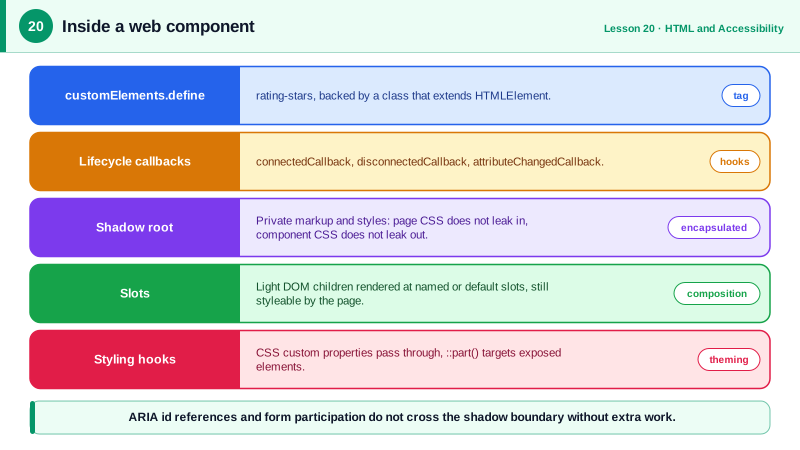
Web components are a set of browser standards for building reusable elements without a framework. Custom elements let you define a new tag, such as rating-stars, backed by a JavaScript class that extends HTMLElement. The browser calls lifecycle methods: connectedCallback when the element is added to the document, disconnectedCallback when it is removed, and attributeChangedCallback when one of the attributes listed in observedAttributes changes. Custom element names must contain a hyphen, which guarantees they never collide with future standard elements.
Shadow DOM gives an element a private DOM subtree, the shadow root, whose markup and styles are encapsulated. Styles defined inside do not leak out, and page styles do not leak in, apart from inherited properties such as color and font. That solves a real problem for widgets embedded in unknown pages, such as a third-party chat widget or a design system used by many teams with different CSS. Slots let the component's user pass content in: children of the custom element are projected into slot elements inside the shadow root, by name or into the default slot, while remaining in the light DOM where the page can style and query them.
Styling from outside goes through deliberate holes in the encapsulation. CSS custom properties inherit through the shadow boundary, so a component can expose variables such as a brand color. The part attribute on internal elements lets outside CSS target them with the ::part() pseudo-element. Inside the shadow root, the :host selector styles the custom element itself, and ::slotted styles projected children at the top level. Declarative shadow DOM, a template element with a shadowrootmode attribute, lets the server render shadow roots in HTML so components display before JavaScript loads.
Web components bring their own challenges. Accessibility relationships such as aria-labelledby cannot reference ids across shadow boundaries, so labels and inputs on different sides do not connect. Form controls inside a shadow root do not participate in the outer form unless the element uses ElementInternals with formAssociated. Server rendering requires declarative shadow DOM. And frameworks differ in how they pass properties and listen to events on custom elements, though React 19 added full support for custom element properties and events.
The sweet spot is shared, framework-agnostic building blocks: design system primitives used by apps written in React, Angular, Vue and plain HTML, embeddable widgets, and leaf components that must look the same everywhere. Large companies such as Adobe, Salesforce and GitHub build parts of their design systems this way. For application-level state and composition, framework components remain more convenient.
| Feature | API | Purpose |
|---|---|---|
| Define a tag | customElements.define('x-y', Class) | Register a new element |
| Lifecycle | connectedCallback, disconnectedCallback | Setup and teardown |
| Attribute changes | observedAttributes, attributeChangedCallback | React to attribute updates |
| Encapsulation | attachShadow({ mode: 'open' }) | Private markup and styles |
| Composition | slot and slot name | Project user content |
| Theming | CSS custom properties, ::part() | Controlled styling from outside |
| Forms | ElementInternals, formAssociated | Take part in form submission |
| Server rendering | template shadowrootmode | Shadow DOM in HTML |
Worked Example: A Themeable Rating Element
The element renders stars in its shadow root, reflects its value as an attribute, exposes a CSS variable and a part for styling, and announces itself correctly.
class RatingStars extends HTMLElement {
  static observedAttributes = ['value', 'max'];

  constructor() {
    super();
    this.attachShadow({ mode: 'open' }).innerHTML = `
      <style>
        :host { display: inline-flex; gap: 2px; color: var(--rating-color, #f59e0b); }
        span { font-size: var(--rating-size, 1.25rem); }
        .off { opacity: 0.25; }
      </style>
      <span part="stars" aria-hidden="true"></span>
      <slot name="label"></slot>`;
  }

  connectedCallback() {
    this.setAttribute('role', 'img');                   // the whole element is one image
    this.render();
  }

  attributeChangedCallback() { this.render(); }

  render() {
    const value = Number(this.getAttribute('value') ?? 0);
    const max = Number(this.getAttribute('max') ?? 5);
    const stars = this.shadowRoot.querySelector('[part="stars"]');
    stars.innerHTML = Array.from({ length: max }, (_, i) =>
      `<span class="${i < value ? 'on' : 'off'}">★</span>`).join('');
    this.setAttribute('aria-label', `Rated ${value} out of ${max}`);
  }
}
customElements.define('rating-stars', RatingStars);<rating-stars value="4" max="5"><span slot="label">(132 reviews)</span></rating-stars>
<style>
rating-stars { --rating-color: #6b21a8; } /* theme through a custom property */
rating-stars::part(stars) { letter-spacing: 2px; } /* style an exposed part */
</style>The innerHTML inside render is safe here because it is built only from numbers. The element works identically in a React app, an Angular app or a static page, which is exactly the reuse that makes web components attractive for design systems.
Real-World Examples
- Adobe's Spectrum Web Components and Salesforce's Lightning Web Components build large design systems on custom elements and shadow DOM so the same components can be used across products built with different frameworks.
- React 19, released in December 2024, added full support for custom elements, passing properties instead of string attributes where appropriate and supporting custom events, which closed a long-standing gap on the Custom Elements Everywhere compatibility test suite.
Review Questions & Answers
It encapsulates the component's internal markup and stylesheets, so selectors do not match across the boundary in either direction. Inherited CSS properties such as color and font-family, and CSS custom properties, still pass through, as do events, which are retargeted to the host element.
Children of the custom element stay in the light DOM but are rendered at the position of a matching slot inside the shadow root, by slot name or in the default slot. The page can still style and query those children because they are not moved into the shadow tree.
Through deliberate styling hooks: CSS custom properties that the component reads, and elements marked with the part attribute that outside CSS can target with ::part(). The component author decides which hooks to expose.
ID references used by ARIA attributes such as aria-labelledby and aria-describedby, and the for attribute of labels, cannot cross shadow boundaries. A label outside the component cannot reference an input inside it, so components must handle labeling internally, often by accepting the label through a slot or attribute.