HTML Form Validation: Labels and Input Types
On this page
Learning Objective
Build forms on native elements: associate labels correctly, pick input types and autocomplete tokens that help users and password managers, use built-in constraint validation and its JavaScript API, and present errors in an accessible way while keeping the server as the final authority.
Concept Explanation
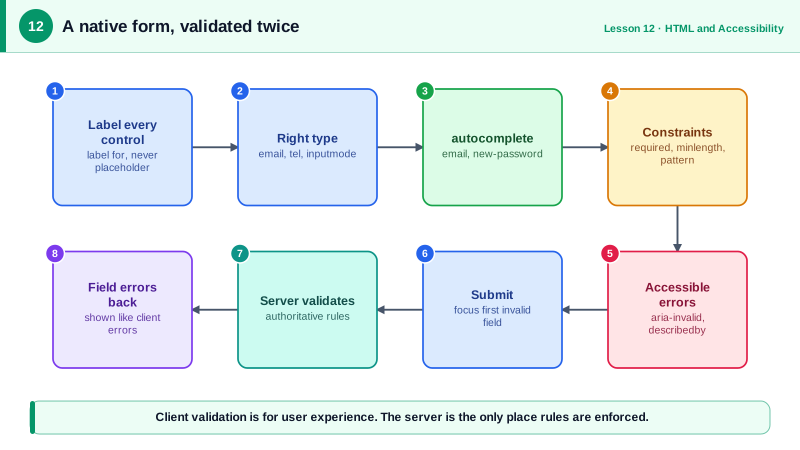
Forms are where users do the work that matters to a business: signing up, paying, searching, contacting support. The browser already ships a capable forms engine, and most form problems come from bypassing it. The first rule is that every control needs a label. A label element linked by for and id, or wrapping the input, gives the control an accessible name, makes the label text clickable to focus the control, and is what testing libraries query with getByLabelText. Placeholder text is not a label: it disappears as soon as the user types and often has poor contrast.
Input types change the experience on every device. type="email" brings an email keyboard on phones and basic format checking. type="tel" brings a numeric dial pad. inputmode="numeric" brings digits without the quirks of type="number", which is meant for quantities, not codes or card numbers. type="date" brings a native picker. The autocomplete attribute tells the browser and password managers what a field is, using tokens such as email, given-name, street-address, one-time-code, current-password and new-password. Correct tokens let users fill forms in seconds and make password managers work reliably.
Constraint validation is built in. Attributes such as required, minlength, maxlength, min, max, step and pattern let the browser check values before submission. CSS pseudo-classes such as :invalid and :user-invalid style fields, with :user-invalid waiting until the user has interacted, so an empty form does not shout errors on load. The JavaScript API exposes the same machinery: checkValidity and reportValidity on fields and forms, the validity object with flags such as valueMissing and typeMismatch, and setCustomValidity for your own rules.
Many teams add novalidate to the form and render their own error messages, because native error bubbles cannot be styled and differ between browsers. That is fine, as long as the validity API is still used to detect problems and errors are presented accessibly: each message is associated with its field through aria-describedby, the field gets aria-invalid="true", and on submit focus moves to the first invalid field or to an error summary at the top. Messages should say how to fix the problem, not only that something is wrong.
One rule never changes: client-side validation is for user experience. Anyone can disable it, edit the DOM or call the API directly. The server must validate every field again and return errors the client can map back onto fields (Day 68 covers that loop at scale).
| Need | Native feature | Benefit |
|---|---|---|
| Name a control | label for or wrapping label | Accessible name, bigger click target |
| Right keyboard on phones | type email, tel, url or inputmode | Fewer typing errors |
| Fast autofill | autocomplete tokens | Password managers and address fill work |
| Required and format rules | required, pattern, minlength, min, max | Validation without JavaScript |
| Style errors after interaction | :user-invalid | No errors on an untouched form |
| Custom rules | setCustomValidity | Integrates with the same API |
| Accessible messages | aria-describedby, aria-invalid | Errors announced with the field |
Worked Example: A Sign-Up Form with Native Validation and Accessible Errors
The form uses native types, autocomplete tokens and constraints. JavaScript takes over the presentation of errors while still using the browser's validity checks.
<class="tok-k">form id="signup" novalidate>
  <class="tok-k">div class="field">
    <class="tok-k">label for="email">Email</class="tok-k">label>
    <class="tok-k">input id="email" name="email" type="email" autocomplete="email" required aria-describedby="email-err">
    <class="tok-k">p id="email-err" class="error" hidden></class="tok-k">p>
  </class="tok-k">div>
  <class="tok-k">div class="field">
    <class="tok-k">label for="password">Password</class="tok-k">label>
    <class="tok-k">input id="password" name="password" type="password" autocomplete="new-password"
           required minlength="12" aria-describedby="password-hint password-err">
    <class="tok-k">p id="password-hint">At least 12 characters.</class="tok-k">p>
    <class="tok-k">p id="password-err" class="error" hidden></class="tok-k">p>
  </class="tok-k">div>
  <class="tok-k">button type="submit">Create account</class="tok-k">button>
</class="tok-k">form>const form = document.querySelector('#signup');
function messageFor(input) {
const v = input.validity;
if (v.valueMissing) return `Enter your ${input.labels[0].textContent.toLowerCase()}.`;
if (v.typeMismatch) return 'Enter an email address like name@example.com.';
if (v.tooShort) return `Use at least ${input.minLength} characters.`;
return input.validationMessage;
}
function showError(input) {
const err = document.getElementById(`${input.id}-err`);
const ok = input.checkValidity();
input.setAttribute('aria-invalid', String(!ok));
err.hidden = ok;
err.textContent = ok ? '' : messageFor(input);
return ok;
}
form.addEventListener('blur', (e) => { if (e.target.matches('input')) showError(e.target); }, true);
form.addEventListener('submit', async (e) => {
e.preventDefault();
const inputs = [...form.querySelectorAll('input')];
const firstInvalid = inputs.find((i) => !showError(i));
if (firstInvalid) { firstInvalid.focus(); return; }
const res = await fetch('/api/signup', { method: 'POST', body: new FormData(form) });
if (res.status === 400) {
const { errors } = await res.json(); // the server validates again and is authoritative
for (const [name, msg] of Object.entries(errors)) {
const input = form.elements[name];
input.setCustomValidity(msg); showError(input); input.setCustomValidity('');
}
}
});The blur listener uses the capture phase because blur does not bubble. Server errors flow through setCustomValidity so they appear exactly like client errors, in the same place, with the same announcement.
Real-World Examples
- The Baymard Institute's large-scale checkout usability research reports that the average checkout has far more form fields than necessary and that inline validation and properly configured autofill are among the most effective improvements to completion rates.
- The HTML autocomplete specification added the one-time-code token, and iOS and Android use it to offer SMS verification codes directly above the keyboard, which is why many banks and sign-in flows added autocomplete="one-time-code" to their code fields.
Review Questions & Answers
The placeholder disappears when the user starts typing, so they lose the description of the field, it is often low contrast, and it is not reliably exposed as the accessible name. A label stays visible, names the control for assistive technology and enlarges the click target.
:invalid matches any field that currently fails its constraints, including empty required fields on a freshly loaded form. :user-invalid only matches after the user has interacted with the field or tried to submit, so errors are not shown before the user has had a chance to fill the form.
They tell password managers whether to suggest generating a strong new password or to fill a saved one. Without them, managers guess, often fill a sign-up form with an old password or fail to offer generation, which weakens security and frustrates users.
Client validation can be bypassed by disabling JavaScript, editing the page or sending requests directly to the API. It exists to give fast feedback. The server is the only place that can enforce rules, so it must validate every field and return errors the client can display.