Accessibility Tree and ARIA Explained
On this page
Learning Objective
Explain how browsers build an accessibility tree from the DOM, what role, name, state and value mean for assistive technology, what ARIA can and cannot change, and why the first rule of ARIA is to use native HTML whenever possible.
Concept Explanation
Alongside the render tree, the browser builds a second structure: the accessibility tree. It is a simplified view of the DOM in which each meaningful node is described by four things. Its role says what it is: button, link, checkbox, heading, navigation. Its name is the text that identifies it, such as Save or Search products. Its states and properties say what condition it is in: checked, expanded, disabled, the heading level. Its value applies to things like sliders and text fields. Screen readers, voice control software, switch devices and automation tools read this tree through platform accessibility APIs, not the pixels on screen.
Native HTML elements populate the tree automatically. A button element has role button, its text content becomes its name, and disabled becomes a state. A checkbox input exposes checked or unchecked. Decorative containers such as div and span have generic roles and are often pruned. You can inspect all of this in the Accessibility pane of Chrome or Firefox DevTools, and doing so for your own components is one of the fastest ways to understand what a screen reader user will experience.
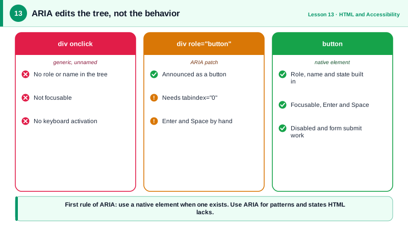
ARIA, Accessible Rich Internet Applications, is a set of attributes that edit the accessibility tree. role changes what an element is, aria-label and aria-labelledby set its name, aria-describedby adds a description, and attributes such as aria-expanded, aria-checked, aria-selected and aria-current express state. Crucially, ARIA changes only the tree. It does not add behavior. A div with role button is announced as a button, but it is still not focusable, does not respond to Enter or Space, and does not submit forms. Everything else must be built by hand.
That is why the W3C's first rule of ARIA use says: if a native HTML element or attribute has the semantics and behavior you need, use it instead of repurposing an element and adding ARIA. ARIA is for patterns HTML does not provide natively, such as tabs, comboboxes, tree views and live regions, or for adding states that HTML lacks, such as aria-expanded on a disclosure button. Misused ARIA is worse than none: WebAIM's analysis of a million home pages found that pages with ARIA present averaged more detected errors than pages without it.
A few other rules complete the picture. Do not change native semantics unnecessarily, such as putting role="heading" on a button. All interactive ARIA controls must be keyboard operable. Do not hide focusable elements with aria-hidden="true" or role="presentation". And every interactive element must have an accessible name. Live regions, marked with aria-live or roles such as status and alert, are a special case: they announce content changes, such as "Saved" or "3 results", without moving focus.
| Concept | Meaning | Example |
|---|---|---|
| Role | What the element is | button, link, tab, dialog |
| Name | What it is called | Close dialog, Search products |
| State | Its current condition | aria-expanded="true", checked |
| Description | Extra help text | aria-describedby pointing at a hint |
| Live region | Announces changes | role="status" with "Item saved" |
| aria-hidden | Removes from the tree | Decorative icons, never focusable items |
| First rule of ARIA | Prefer native HTML | button over div role="button" |
Worked Example: An Icon Button, Done Three Ways
The same close button is written badly, with ARIA patching a div, and natively. The accessibility tree shows the difference.
<!-- 1. Broken: no role, no name, not focusable, no keyboard support -->
<div class="close" onclick="closePanel()"><svg>...</svg></div>

<!-- 2. ARIA patch: now announced correctly, but you must rebuild the behavior -->
<div class="close" role="button" tabindex="0" aria-label="Close panel"
     onclick="closePanel()" onkeydown="if (event.key === 'Enter' || event.key === ' ') { event.preventDefault(); closePanel(); }">
  <svg aria-hidden="true" focusable="false">...</svg>
</div>

<!-- 3. Native: role, focus, Enter and Space all included -->
<button type="button" class="close" aria-label="Close panel" onclick="closePanel()">
  <svg aria-hidden="true" focusable="false">...</svg>
</button>

<!-- State that HTML lacks: ARIA adds it to a native button -->
<button type="button" aria-expanded="false" aria-controls="filters" id="filters-toggle">Filters</button>
<div id="filters" hidden>...</div>

<!-- A live region announces results without moving focus -->
<p role="status" id="result-count"></p>const toggle = document.querySelector('#filters-toggle');
toggle.addEventListener('click', () => {
const open = toggle.getAttribute('aria-expanded') === 'true';
toggle.setAttribute('aria-expanded', String(!open));
document.querySelector('#filters').hidden = open;
});
function showResults(n) {
document.querySelector('#result-count').textContent = `${n} results`; // announced politely
}In the DevTools accessibility pane, version one shows a generic element with no name, version two shows a button named Close panel, and version three shows the same with less code and no risk of missing a key. The SVGs are hidden from the tree because the button already has a name.
Real-World Examples
- The W3C document "Using ARIA" states the first rule of ARIA use, and the ARIA Authoring Practices Guide (APG) provides reference implementations with keyboard interaction tables for patterns like tabs, menus and comboboxes that HTML does not provide.
- The WebAIM Million report has repeatedly found that home pages using ARIA had more detected accessibility errors on average than pages that did not, which the report attributes to ARIA being used incorrectly or to compensate for poor underlying markup.
Review Questions & Answers
Its role, which says what kind of thing it is; its name, which identifies it; its states and properties, such as expanded or checked; and, for some widgets, its value, such as the current position of a slider or the text in a field.
ARIA only changes how the element is exposed to assistive technology. The div is still not focusable without tabindex, does not activate on Enter or Space, cannot be disabled natively and does not take part in form submission. All of that must be implemented manually.
When HTML has no native element with the required semantics and behavior, such as tabs, comboboxes or tree views, or when you need to express a state HTML lacks, such as aria-expanded on a button that toggles a panel, or to announce dynamic changes with a live region.
aria-hidden removes the element from the accessibility tree, but keyboard focus can still reach it. A screen reader user would then land on something that is announced as nothing, which is confusing and can make the interface unusable.