HTML dialog Element and the Popover API
On this page
Learning Objective
Use the native dialog element for modal and non-modal dialogs, details and summary for disclosures and accordions, and the Popover API for menus, toggletips and other light-dismiss overlays, so you get focus handling, the top layer and accessibility without custom scripts.
Concept Explanation
For years, every modal, dropdown and accordion on the web was hand-built, and most of them had the same bugs: focus escaped behind the modal, Escape did nothing, z-index battles hid the overlay under a sticky header, and screen readers could still read the page behind it. The platform now ships native versions of these patterns, and they solve most of those problems by default.
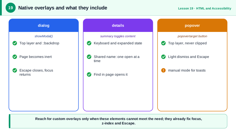
The dialog element opened with showModal creates a modal dialog. The browser places it in the top layer, a special layer above all other content regardless of z-index or overflow, renders a ::backdrop pseudo-element behind it, makes the rest of the page inert so focus and screen readers cannot reach it, moves focus into the dialog, and closes it on Escape. When closed, focus returns to the element that was focused before. A form inside the dialog with method="dialog" closes it on submit and sets returnValue to the button's value, which makes confirmation dialogs very short. Calling show instead of showModal opens a non-modal dialog without those restrictions.
The details and summary elements create a disclosure: a summary that toggles the visibility of the rest of the content. They are keyboard accessible, expose expanded and collapsed state to assistive technology, and fire a toggle event. Giving several details elements the same name attribute makes them an exclusive accordion where opening one closes the others, which is now supported in all major browsers. Content inside a closed details element can also be found by the browser's find in page feature, which opens it automatically.
The Popover API covers non-modal overlays such as menus, pickers, teaching tips and toasts. Add the popover attribute to an element and a button with popovertarget pointing at its id, and you get a toggle without JavaScript. Popovers render in the top layer, so they are never clipped by overflow hidden ancestors. With the default auto value they light-dismiss: clicking outside or pressing Escape closes them, and opening one closes other unrelated auto popovers. popover="manual" disables light dismiss for things like toasts. The browser also sets the right relationship so assistive technology knows the button controls the popover.
Positioning popovers next to their trigger used to require a JavaScript library. CSS anchor positioning now lets you tether an element to an anchor and flip it when it would overflow, and it pairs naturally with popovers, though support should be checked for your audience and a library like Floating UI remains a fallback.
| Need | Native element | What the browser handles |
|---|---|---|
| Modal dialog | dialog with showModal | Top layer, backdrop, inert page, Escape, focus return |
| Non-modal dialog | dialog with show | Open state, no page blocking |
| Confirm and choose | form method="dialog" | Closes and sets returnValue |
| Disclosure | details and summary | Toggle, keyboard, expanded state |
| Exclusive accordion | details with a shared name | Only one open at a time |
| Menu or picker | popover and popovertarget | Top layer, light dismiss, Escape |
| Toast | popover="manual" | Top layer without light dismiss |
Worked Example: A Confirm Dialog, an Accordion and a Menu Without Libraries
All three patterns use native elements. The only script is the code that reacts to the user's choice.
<!-- Modal confirmation -->
<button id="delete-btn" type="button">Delete project</button>
<dialog id="confirm" aria-labelledby="confirm-title">
  <form method="dialog">
    <h2 id="confirm-title">Delete this project?</h2>
    <p>This removes all files and cannot be undone.</p>
    <button value="cancel" autofocus>Cancel</button>
    <button value="delete" class="danger">Delete</button>
  </form>
</dialog>

<!-- Exclusive accordion -->
<details name="faq" open><summary>How do I reset my password?</summary><p>...</p></details>
<details name="faq"><summary>Can I change my plan?</summary><p>...</p></details>

<!-- Menu with the Popover API: no JavaScript needed to open or dismiss -->
<button popovertarget="user-menu">Account</button>
<div id="user-menu" popover>
  <a href="/settings">Settings</a>
  <a href="/logout">Sign out</a>
</div>const dialog = document.querySelector('#confirm');
document.querySelector('#delete-btn').addEventListener('click', () => dialog.showModal());
dialog.addEventListener('close', () => {
if (dialog.returnValue === 'delete') deleteProject(); // focus already returned to the trigger
});dialog::backdrop { background: rgb(0 0 0 / 0.5); }
#user-menu { margin: 0; inset: auto; } /* position with anchor positioning or a library */The Cancel button has autofocus, so the safe choice receives focus when the dialog opens. Pressing Escape closes the dialog with an empty returnValue, which the close handler treats as cancel.
Real-World Examples
- The Popover API became Baseline newly available in 2024 when it shipped in all major browser engines, and the Open UI community group, which incubated it, documented that it was designed to replace the many custom implementations of menus, tooltips and pickers found in component libraries.
- The name attribute that turns details elements into an exclusive accordion shipped in Chrome 120 and Safari 17.2 in late 2023 and in Firefox 130 in 2024, replacing a pattern that previously needed custom JavaScript in almost every accordion component.
Review Questions & Answers
It places the dialog in the top layer above everything, adds a backdrop, makes the rest of the page inert so focus and assistive technology cannot reach it, moves focus into the dialog, closes on Escape and returns focus to the previously focused element when it closes.
A rendering layer that sits above all other content regardless of z-index, stacking contexts or overflow clipping on ancestors. Dialogs opened modally, popovers and fullscreen elements use it, which eliminates the classic problem of overlays hidden behind sticky headers or clipped by containers.
Give each details element the same name attribute. The browser then treats them as a group and closes the others when one is opened, with no JavaScript needed.
Light dismiss means the overlay closes when the user clicks outside it or presses Escape. Popovers with the default auto mode provide it; popover="manual" disables it, which is useful for toasts or overlays that must stay until explicitly closed.