CSS Container Queries Explained
On this page
Learning Objective
Style components based on the size of their container instead of the viewport, set up containment with container-type and container names, use container query units, query container styles, and combine container queries with intrinsic layout techniques so components work anywhere they are placed.
Concept Explanation
Media queries answer the question "how wide is the screen?". Components usually need a different answer: "how much room do I have?". A product card might sit in a three-column grid on the home page, a narrow sidebar on the product page and a full-width list in search results, all on the same desktop screen. With media queries the card cannot know which situation it is in. Container queries let a component adapt to the size of its container, which makes components truly portable.
Using them takes two steps. First, an ancestor is declared a query container with container-type: inline-size, which tells the browser to track its inline size and applies size containment on that axis. Optionally it gets a name with container-name, so nested components can target a specific container rather than the nearest one. Second, styles inside an @container rule apply when the container matches the condition, such as @container card (width >= 28rem). The container itself cannot be styled by its own query, because that would create a loop: an element's styles cannot depend on its own size. That is why you usually make a wrapper the container and style its children.
Container query units are relative to the container: cqi is one percent of the container's inline size and cqb one percent of its block size. They are ideal for fluid type and spacing inside a component, the container equivalent of clamp with vw from Day 26, for example font-size: clamp(1rem, 0.8rem + 2cqi, 1.5rem). Style queries are a newer addition that query the computed value of custom properties on the container, such as @container style(--variant: featured), letting a parent switch a child's theme without adding classes to every descendant. Size container queries are supported in all major browsers since 2023; style queries for custom properties have broader support than they once did but should be checked for your audience.
Container queries are one part of intrinsic design, the idea that layouts should respond to their content and context rather than to fixed breakpoints. Other parts come from earlier lessons: grid with auto-fill and minmax, flex-wrap with sensible flex-basis values, clamp for sizes and min, max and fit-content for widths. Many layouts need no queries at all once these are combined well. A useful division of labor is to use media queries for page-level structure and user preferences, and container queries for component internals.
One caveat: size containment means the container's inline size cannot depend on its children. A container-type element inside a shrink-to-fit context, such as an inline-block or an auto-width flex item, can collapse to zero width. Containers should get their width from their parent layout.
| Feature | Syntax | Purpose |
|---|---|---|
| Declare a container | container-type: inline-size | Track inline size for queries |
| Name a container | container-name: card | Target a specific ancestor |
| Shorthand | container: card / inline-size | Name and type together |
| Size query | @container card (width >= 28rem) | Restyle children by container size |
| Container units | cqi, cqb, cqmin | Fluid sizes relative to the container |
| Style query | @container style(--variant: featured) | Restyle by a custom property value |
| Intrinsic layout | auto-fill, minmax, clamp, fit-content | Adapt without any query |
Worked Example: A Product Card That Works in Any Slot
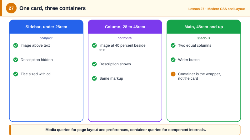
The same card markup renders as a compact stacked card in a narrow sidebar and as a horizontal card with a larger image in a wide main column.
<class="tok-k">div class="card-slot">
  <class="tok-k">article class="product-card">
    <class="tok-k">img src="/shoe.jpg" alt="Trail running shoe in orange" width="600" height="400">
    <class="tok-k">div class="info">
      <class="tok-k">h3>Trail Runner 2</class="tok-k">h3>
      <class="tok-k">p class="price">$129</class="tok-k">p>
      <class="tok-k">p class="desc">Grippy outsole, breathable mesh, 280 grams.</class="tok-k">p>
      <class="tok-k">button>Add to cart</class="tok-k">button>
    </class="tok-k">div>
  </class="tok-k">article>
</class="tok-k">div>.card-slot { container: card / inline-size; } /* the wrapper is the container */
.product-card { display: grid; gap: 0.75rem; }
.product-card img { inline-size: 100%; block-size: auto; border-radius: 8px; }
.product-card h3 { font-size: clamp(1rem, 0.85rem + 2cqi, 1.6rem); }
.product-card .desc { display: none; } /* hidden when space is tight */
@container card (width >= 28rem) {
.product-card { grid-template-columns: 40% 1fr; align-items: start; }
.product-card .desc { display: block; }
}
@container card (width >= 48rem) {
.product-card { grid-template-columns: 1fr 1fr; }
.product-card button { justify-self: start; padding-inline: 2rem; }
}
/* A parent opts a card into a featured theme without extra classes */
.promo { --variant: featured; }
@container style(--variant: featured) {
.product-card { outline: 2px solid #6b21a8; outline-offset: 4px; }
}Place the same .card-slot in a 300 pixel sidebar and a 900 pixel main column on one page: the sidebar shows the compact card and the main column the horizontal one, without any media query or modifier class.
Real-World Examples
- Container queries were among the most requested CSS features for over a decade, and shipped in Chrome 105, Safari 16 and Firefox 110 between 2022 and early 2023; the State of CSS survey consistently ranked them among the features developers were most excited to use.
- Miriam Suzanne, who edited the CSS containment and container queries specifications, described the goal as letting design system components respond to their placement, solving the problem that media queries tie component styles to the page instead of the component.
Review Questions & Answers
The container's size would then depend on styles that depend on its size, creating a circular dependency. Size containment breaks the loop by making the container's inline size independent of its contents, and queries only apply to descendants.
For page-level layout decisions that genuinely depend on the viewport, such as whether the navigation is a sidebar or a menu, and for user and device preferences such as reduced motion, color scheme or pointer type. Component-level adaptations belong in container queries.
Container query inline units: 1cqi equals one percent of the inline size of the nearest query container. They let type and spacing inside a component scale with the component's width rather than the viewport.
Size containment means the container ignores its children when computing its inline size. If its width would normally come from its content, as in an inline-block or an auto-width flex item, it can collapse to zero, so containers need a width defined by their parent layout.