CSS Animations, Transitions and View Transitions
On this page
Learning Objective
Animate interfaces with CSS transitions and keyframe animations, choose durations and easing that feel natural, animate entry and exit including display changes, use the View Transitions API for animated state and page changes, and keep every animation fast and respectful of reduced motion.
Concept Explanation
Motion in an interface should explain change: where something came from, where it went, what is now in focus. CSS offers two basic tools. A transition animates a property from its old value to its new value whenever it changes, for example a button's background on hover or a panel's transform when a class is added. You declare which properties to transition, the duration, the easing and an optional delay. A keyframe animation defines a sequence of states with @keyframes and plays it independently of state changes, with control over iteration count, direction, fill mode and play state.
Good motion is quick and eased. Most interface transitions sit between 150 and 300 milliseconds; longer animations make an interface feel slow. Easing describes acceleration: ease-out, fast at first then slowing, suits elements entering, because they respond immediately; ease-in suits elements leaving. The linear() function can describe complex curves such as springs and bounces in pure CSS. As Day 8 showed, animating transform and opacity keeps animations on the compositor and smooth, while animating layout properties is expensive.
Entry and exit animations used to be awkward because display none could not be animated. Two additions fix this. @starting-style defines the styles an element starts from when it is first rendered or goes from display none to visible, so a dialog or popover can fade and slide in. transition-behavior: allow-discrete lets discrete properties such as display and overlay participate in transitions, so the element stays visible until its exit animation finishes. Together they allow animated dialogs and popovers with no JavaScript.
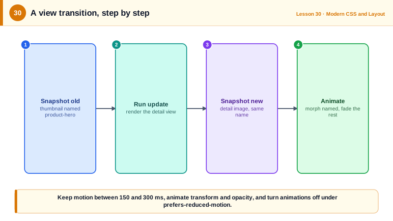
The View Transitions API animates between two states of the page as a whole. You call document.startViewTransition with a callback that updates the DOM. The browser takes a snapshot of the old state, runs your update, takes a snapshot of the new state and cross-fades between them by default. Elements given the same view-transition-name in both states are animated as one, morphing position and size, which creates effects like a thumbnail growing into a detail image. Each part is exposed as pseudo-elements such as ::view-transition-old and ::view-transition-new, so you customize the animation with ordinary CSS. For multi-page sites, cross-document view transitions enabled with @view-transition { navigation: auto; } animate between full page loads on the same origin.
Every animation must respect prefers-reduced-motion from Day 16. A common approach is to define motion with duration tokens that become zero under reduced motion, and to replace large movements with simple fades rather than removing feedback entirely. Avoid animating content that users are trying to read, and never make essential information available only through motion.
| Tool | Best for | Key syntax |
|---|---|---|
| Transition | State changes such as hover, open, selected | transition: transform 200ms ease-out |
| Keyframe animation | Loops and sequences | @keyframes plus animation |
| @starting-style | Entry animation from display none | @starting-style { opacity: 0 } |
| allow-discrete | Animating display and overlay | transition-behavior: allow-discrete |
| View transition, same document | Animated DOM updates | document.startViewTransition(update) |
| Shared element | Morph one element into another | view-transition-name: hero |
| Cross-document | Animated multi-page navigation | @view-transition { navigation: auto; } |
Worked Example: An Animated Popover and a List-to-Detail View Transition
The popover fades and scales in and out without JavaScript. The product grid morphs the selected image into the detail view with the View Transitions API.
/* Popover entry and exit with @starting-style and allow-discrete */
[popover] {
  opacity: 1; transform: scale(1);
  transition: opacity 180ms ease-out, transform 180ms ease-out,
              overlay 180ms allow-discrete, display 180ms allow-discrete;
}
[popover]:not(:popover-open) { opacity: 0; transform: scale(0.96); }
@starting-style {
  [popover]:popover-open { opacity: 0; transform: scale(0.96); }
}

/* View transition customization */
::view-transition-old(root), ::view-transition-new(root) { animation-duration: 220ms; }
.detail-image { view-transition-name: product-hero; }

@media (prefers-reduced-motion: reduce) {
  [popover] { transition: none; }
  ::view-transition-group(*), ::view-transition-old(*), ::view-transition-new(*) { animation: none; }
}function showDetail(product, thumbnail) {
const update = () => renderDetail(product); // swaps the grid for the detail view
if (!document.startViewTransition) { update(); return; } // progressive enhancement
thumbnail.style.viewTransitionName = 'product-hero'; // pair the thumbnail with the detail image
const transition = document.startViewTransition(update);
transition.finished.finally(() => { thumbnail.style.viewTransitionName = ''; });
}Only one element may have a given view-transition-name at a time, which is why the name is put on the clicked thumbnail just before the transition and removed afterward. Browsers without the API simply update the DOM without animation.
Real-World Examples
- Same-document view transitions shipped in Chrome 111 in 2023 and in Safari 18 in 2024, and cross-document view transitions followed in Chrome 126 and Safari 18.2, giving multi-page sites animated navigations that previously required a single page application.
- Material Design's motion guidelines recommend short durations for most interface transitions, typically between 100 and 300 milliseconds depending on the size of the change, with longer durations reserved for large, full-screen transitions.
Review Questions & Answers
Use a transition when a property should animate between two states as a response to a change, such as hover or a class toggle. Use a keyframe animation for multi-step sequences, loops or animations that run on their own without a state change, such as a loading spinner.
Elements appearing from display none have no previous style to transition from, so entry animations did not run, and display could not be animated, so exit animations were cut off. @starting-style provides the starting values for entry, and allow-discrete lets display and overlay switch at the end of the exit transition.
The browser snapshots the old and new states around the DOM update. Elements that share the same view-transition-name in the old and new states are captured as one transition group, and the browser animates its position and size from old to new while cross-fading their images.
Inside a prefers-reduced-motion: reduce media query, remove or shorten the animations on the view transition pseudo-elements, or skip calling startViewTransition and update the DOM directly, so users who are sensitive to motion get instant changes.