Responsive Images: srcset, sizes and picture
On this page
Learning Objective
Write meaningful alternative text, serve images at the right resolution with srcset and sizes, switch formats and art direction with the picture element, prevent layout shift with width and height, and decide when to lazy load and when to prioritize an image.
Concept Explanation
Images are usually the heaviest part of a page and often its most important content, so they deserve both accessibility and performance attention. Start with alt text, which is the image's accessible name and what is shown if the image fails to load. Good alt text conveys the image's purpose in context, not a literal description of pixels. A product photo might be "Blue canvas backpack with leather straps, front view". A logo that links home should be named for the destination, such as "Acme home". A purely decorative image gets an empty alt attribute, alt="", so screen readers skip it; omitting alt entirely is different and causes some screen readers to read the file name.
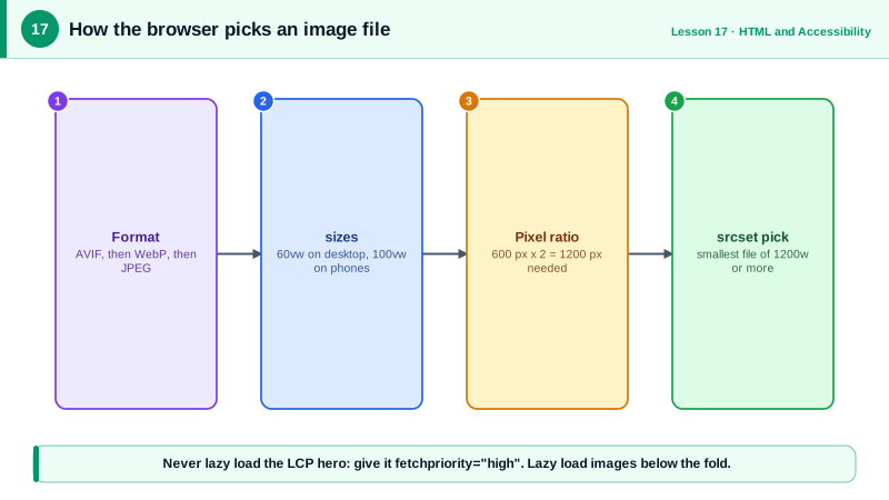
Resolution switching is the problem of serving the same image at different sizes. A 2400 pixel wide hero is wasted on a 375 pixel phone. The srcset attribute lists available files with their widths, such as hero-800.jpg 800w, and the sizes attribute tells the browser how wide the image will be displayed at different viewport widths, such as (min-width: 1024px) 50vw, 100vw. The browser combines those with the device pixel ratio and picks the smallest file that will look sharp. Without sizes, the browser assumes the image fills the viewport, which leads to oversized downloads for images in narrow columns.
The picture element handles two other problems. Format switching lets you offer AVIF and WebP with a JPEG fallback using source elements with a type; the browser picks the first format it supports, and AVIF files are often roughly half the size of equivalent JPEGs. Art direction lets you serve a differently cropped image at different breakpoints using source elements with media queries, for example a tight portrait crop on phones and a wide landscape on desktops. The img inside picture remains required: it carries alt, width, height and the fallback.
Always include width and height attributes with the image's intrinsic dimensions. Browsers use them to compute an aspect ratio before the image loads, reserving the right amount of space so content below does not jump when it arrives, which directly prevents Cumulative Layout Shift (Day 85). CSS can still make the image responsive with width 100 percent and height auto.
Loading strategy is the final decision. loading="lazy" defers off-screen images until the user scrolls near them, saving bandwidth. But never lazy load the image most likely to be the Largest Contentful Paint element, typically the hero at the top: that delays the most important paint. Instead give it fetchpriority="high" so the browser requests it early. decoding="async" lets the browser decode images off the critical path.
| Attribute or element | Solves | Example |
|---|---|---|
| alt | Accessible name, fallback text | alt="" for decorative images |
| srcset with w descriptors | Choose a file by width | img-400.jpg 400w, img-800.jpg 800w |
| sizes | Tell the browser the display width | (min-width: 800px) 33vw, 100vw |
| picture with type | Modern formats with fallback | AVIF, then WebP, then JPEG |
| picture with media | Art direction by breakpoint | Portrait crop on small screens |
| width and height | Reserve space, prevent layout shift | width="1200" height="800" |
| loading="lazy" | Defer off-screen images | Below the fold galleries |
| fetchpriority="high" | Load the LCP image early | The hero image |
Worked Example: A Product Hero and a Lazy Gallery
The hero uses modern formats, resolution switching and high priority. The gallery images below the fold are lazy loaded. Every image reserves its space.
<!-- Hero: likely the LCP element, so never lazy, always high priority -->
<picture>
  <source type="image/avif"
          srcset="/img/pack-640.avif 640w, /img/pack-1280.avif 1280w, /img/pack-1920.avif 1920w"
          sizes="(min-width: 1024px) 60vw, 100vw">
  <source type="image/webp"
          srcset="/img/pack-640.webp 640w, /img/pack-1280.webp 1280w, /img/pack-1920.webp 1920w"
          sizes="(min-width: 1024px) 60vw, 100vw">
  <img src="/img/pack-1280.jpg"
       srcset="/img/pack-640.jpg 640w, /img/pack-1280.jpg 1280w, /img/pack-1920.jpg 1920w"
       sizes="(min-width: 1024px) 60vw, 100vw"
       width="1920" height="1280"
       alt="Blue canvas backpack with leather straps, front view"
       fetchpriority="high" decoding="async">
</picture>

<!-- Art direction: different crops by viewport -->
<picture>
  <source media="(max-width: 600px)" srcset="/img/team-portrait.jpg" width="600" height="800">
  <img src="/img/team-wide.jpg" width="1600" height="600" alt="The Acme design team in the studio">
</picture>

<!-- Gallery below the fold: lazy, with dimensions to prevent shifts -->
<ul class="gallery">
  <li><img src="/img/detail-1-400.jpg" srcset="/img/detail-1-400.jpg 400w, /img/detail-1-800.jpg 800w"
           sizes="(min-width: 800px) 25vw, 50vw" width="800" height="800" loading="lazy"
           alt="Close-up of the waterproof zipper"></li>
  <li><img src="/img/divider.svg" alt="" width="40" height="4"></li>   <!-- decorative -->
</ul>img { max-width: 100%; height: auto; } /* responsive, aspect ratio from width and height */In the Network panel, a phone downloads the 640 pixel AVIF while a desktop with a 2x display downloads a larger file. Gallery images appear in the waterfall only when you scroll toward them.
Real-World Examples
- The HTTP Archive Web Almanac has consistently found that images make up the largest share of page weight on the median web page, and its media chapters track the gradual adoption of srcset, sizes, lazy loading and modern formats such as WebP and AVIF.
- Chrome's documentation on Largest Contentful Paint warns against lazy loading LCP images, and the Chrome team reported that adding fetchpriority="high" to the hero image on Google Flights improved LCP from 2.6 seconds to 1.9 seconds in a lab test.
Review Questions & Answers
alt="" explicitly marks the image as decorative, so assistive technology ignores it. A missing alt attribute tells assistive technology nothing about the image, and some screen readers fall back to announcing the file name, which is noise at best and confusing at worst.
The browser chooses an image before layout, so it does not yet know how wide the image will be displayed. sizes provides that information for different viewport widths. Without it, the browser assumes the image spans the full viewport and may download a much larger file than needed.
When you need to switch formats, offering AVIF or WebP with a fallback through type attributes, or when you need art direction, showing a differently cropped or composed image at different breakpoints through media attributes. For simple resolution switching, srcset and sizes on img are enough.
The hero is usually the Largest Contentful Paint element. Lazy loading delays its request until layout confirms it is near the viewport, which pushes LCP later. It should load eagerly, ideally with fetchpriority="high" so it is requested early.