Accessible Color Contrast and Reduced Motion
On this page
Learning Objective
Meet WCAG contrast requirements for text and interface components, avoid relying on color alone, respect user preferences for reduced motion, color scheme, contrast and text size, and design layouts that survive zooming to 200 percent and text spacing changes.
Concept Explanation
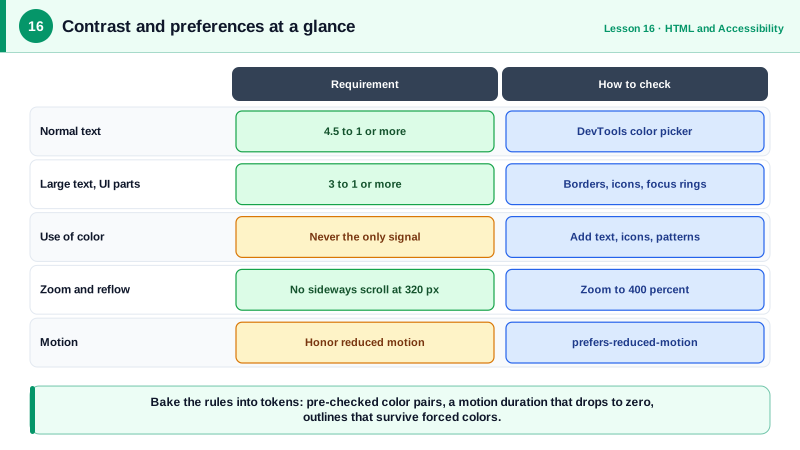
Accessibility is not only about screen readers. Low vision, color vision deficiency, vestibular disorders, migraines, situational limits such as bright sunlight, and aging all affect how people perceive a page. The Web Content Accessibility Guidelines turn much of this into measurable rules, and the most frequently failed one is contrast. WCAG level AA requires a contrast ratio of at least 4.5 to 1 for normal text and 3 to 1 for large text, which is 24 pixels, or about 18.5 pixels when bold. Since WCAG 2.1, user interface components and meaningful graphics such as input borders, focus indicators and chart lines also need at least 3 to 1 against adjacent colors.
Color must never be the only way information is conveyed. About one in twelve men has some form of color vision deficiency, and red versus green is the most commonly confused pair. An error field shown only with a red border, a required field shown only in a different color, or a chart that distinguishes series only by hue fails those users. Add a second channel: an icon, text such as Error, an underline for links within text, patterns or direct labels on charts.
Operating systems let users declare preferences, and CSS media queries expose them. prefers-reduced-motion: reduce signals that animation can make a user ill or distracted; respect it by removing parallax, large movements and auto-playing animation, while keeping subtle fades if they help comprehension. prefers-color-scheme reports light or dark mode, prefers-contrast reports a request for more or less contrast, and forced-colors: active reports Windows High Contrast style modes where the browser replaces your colors with a user palette. In forced colors mode, backgrounds and box shadows disappear, so focus indicators and borders should use outlines or borders rather than shadows alone.
Text must be resizable. Use relative units such as rem for font sizes so that browser font size settings work, never disable zoom in the viewport meta tag, and make sure the layout reflows at 400 percent zoom, equivalent to a 320 pixel wide viewport, without horizontal scrolling for normal content. WCAG also requires that users can override text spacing, line height, paragraph spacing, letter and word spacing, without content being clipped, which rules out fixed heights on text containers.
Building this in from the start is cheap; retrofitting it is expensive. Design tokens with pre-checked contrast pairs, a motion token that collapses to zero under reduced motion, and a component library that already handles forced colors make the accessible choice the default one for every team.
| Requirement | WCAG level AA rule | Practical check |
|---|---|---|
| Normal text contrast | At least 4.5 to 1 | DevTools color picker shows the ratio |
| Large text contrast | At least 3 to 1 | 24 px, or about 18.5 px bold |
| UI components and graphics | At least 3 to 1 | Input borders, icons, focus rings |
| Use of color | Never the only signal | Add text, icons or patterns |
| Reflow | No horizontal scroll at 320 px width | Zoom to 400 percent |
| Text spacing | No loss when users increase spacing | Avoid fixed heights on text |
| Motion | Respect reduced motion preference | prefers-reduced-motion media query |
Worked Example: Respecting Preferences with Tokens and Media Queries
The stylesheet defines color and motion tokens once, then adapts them to the user's dark mode, reduced motion and forced colors settings.
:root {
  --text: #1f2937;            /* 14.7:1 on white */
  --muted: #4b5563;           /* 7.6:1 on white, safe for small text */
  --accent: #6b21a8;          /* 9.0:1 on white */
  --surface: #ffffff;
  --motion-duration: 200ms;
  font-size: 100%;            /* respect the user's browser setting */
}

@media (prefers-color-scheme: dark) {
  :root { --text: #f3f4f6; --muted: #d1d5db; --accent: #d8b4fe; --surface: #111827; }
}

@media (prefers-reduced-motion: reduce) {
  :root { --motion-duration: 0ms; }
  *, *::before, *::after { scroll-behavior: auto !important; }
}

body { color: var(--text); background: var(--surface); font-size: 1rem; line-height: 1.5; }

.toast { transition: transform var(--motion-duration) ease, opacity var(--motion-duration) ease; }

/* Error state: color plus an icon and text, never color alone */
.field[aria-invalid="true"] input { border: 2px solid #b91c1c; }
.field .error::before { content: "Error: "; font-weight: 700; }

/* Forced colors: shadows vanish, so use a real outline */
.card:focus-visible { box-shadow: 0 0 0 3px var(--accent); outline: 2px solid transparent; }
@media (forced-colors: active) {
  .card:focus-visible { outline: 3px solid CanvasText; }
}<!-- Never block zooming -->
<meta name="viewport" content="width=device-width, initial-scale=1">The transparent outline trick matters: in normal mode it is invisible and the shadow shows, while in forced colors mode the browser renders the outline in the user's system color, so the focus indicator never disappears.
Real-World Examples
- WebAIM's annual Million report has found low contrast text on the vast majority of the top one million home pages, typically more than 80 percent of them, making it the single most common automatically detected WCAG failure year after year.
- Apple's iOS and macOS expose Reduce Motion as a system setting that browsers pass to the web through prefers-reduced-motion, and the WCAG 2.1 success criterion Animation from Interactions cites vestibular disorders, where motion can trigger dizziness and nausea, as the reason this preference matters.
Review Questions & Answers
At least 4.5 to 1 for normal size text, at least 3 to 1 for large text, defined as 24 pixels regular or roughly 18.5 pixels bold, and at least 3 to 1 for user interface components and meaningful graphics against adjacent colors.
Users with color vision deficiencies may not perceive the change, and screen reader users get no information from it at all. The error must also be conveyed with text, ideally an icon too, and programmatically with aria-invalid and an associated message.
Remove or greatly reduce non-essential motion such as parallax, large slides, zooms and auto-playing animations, and disable smooth scrolling. Small fades or color changes that aid understanding can stay. Using a motion duration token makes this a one-line change.
In forced colors modes such as Windows High Contrast, the browser removes box shadows and replaces colors, so a shadow-only focus ring disappears. Adding an outline, even a transparent one in normal mode, ensures a visible focus indicator in forced colors.