React Components, Props and Composition
On this page
Learning Objective
Design components with clear responsibilities, pass data down through props, communicate upward with callback props, compose components with children and slot props instead of configuration flags, and decide where to split a growing component.
Concept Explanation
A component is a reusable piece of interface with its own inputs and output: in React, a function that receives props and returns elements. Components let you name parts of the UI, such as ProductCard, Price and AddToCartButton, and build screens out of them the way functions build programs out of smaller functions. Good components have a single clear responsibility and an interface, their props, that is easy to understand without reading their implementation.
Props flow one way: from parent to child. A child cannot change its props; they are read-only inputs owned by the parent. When a child needs to tell its parent something, such as a click or a new value, the parent passes a callback prop like onSelect or onChange, and the child calls it. This one-way data flow makes it easy to trace where any value comes from: up the tree, to whoever owns it. Callback props are named for what happened, onSave, rather than what the parent will do with it, which keeps the child independent of its context.
Composition is the main tool for flexibility. The children prop lets a component wrap arbitrary content: a Card component renders a frame and places whatever it is given inside, without knowing what it is. Named slot props extend this: a Dialog might accept title, children and footer, each of them elements. Compared with configuration props, composition scales much better. A Card with props for showImage, imagePosition, showBadge, badgeColor and footerButtons grows a new flag for every use case and becomes impossible to test. A Card that accepts children lets each use case compose exactly what it needs.
Deciding where to split components is a judgment call, with some good signals. Split when a piece is reused, when a part of the UI has its own state or behavior, when a component becomes hard to name because it does several things, or when a section changes for different reasons than the rest. Do not split purely to make files shorter: a component used once, tightly bound to its parent and with no independent meaning, is often clearer inline.
Typing props with TypeScript turns the component's interface into documentation that the compiler enforces. Use discriminated unions for variants that need different props, as on Day 42, accept the standard HTML attributes of the underlying element where it makes sense, such as all button attributes for a Button, and forward them, so consumers can add aria attributes, data attributes and event handlers without the component author anticipating each one.
| Concept | Example | Guideline |
|---|---|---|
| Props down | price={product.price} | Read-only inputs owned by the parent |
| Events up | onSelect={(id) => ...} | Name by what happened |
| children | Card wraps any content | Prefer over configuration flags |
| Slot props | Dialog title, footer | Named regions of composition |
| Rest props | ...rest onto the element | Consumers can add aria and data attributes |
| Variant props | variant: 'primary' or 'danger' | Small fixed sets, typed as unions |
| Split when | Reused, own state, hard to name | Not just to shorten files |
Worked Example: From a Flag-Heavy Card to Composition
The first Card has a growing list of flags. The composed version provides structure and lets each use case supply its content.
// Before: every new use case adds a flag
<Card title="Trail Runner 2" showImage imageSrc="/shoe.jpg" imagePosition="top"
      showBadge badgeText="New" badgeColor="purple"
      showFooter footerPrimaryLabel="Add to cart" onFooterPrimary={add} />

// After: structure from the component, content from the caller
type CardProps = { children: React.ReactNode; media?: React.ReactNode; footer?: React.ReactNode }
  & React.HTMLAttributes<HTMLElement>;

export function Card({ media, footer, children, className, ...rest }: CardProps) {
  return (
    <article className={['card', className].filter(Boolean).join(' ')} {...rest}>
      {media && <div className="card-media">{media}</div>}
      <div className="card-body">{children}</div>
      {footer && <footer className="card-footer">{footer}</footer>}
    </article>
  );
}

type ButtonProps = { variant?: 'primary' | 'secondary' | 'danger' }
  & React.ButtonHTMLAttributes<HTMLButtonElement>;

export function Button({ variant = 'primary', type = 'button', ...rest }: ButtonProps) {
  return <button type={type} className={`btn btn-${variant}`} {...rest} />;
}

// Usage: each screen composes what it needs
export function ProductCard({ product, onAdd }: { product: Product; onAdd: (id: string) => void }) {
  return (
    <Card
      aria-labelledby={`p-${product.id}`}
      media={<img src={product.image} alt="" width={600} height={400} />}
      footer={<Button onClick={() => onAdd(product.id)}>Add to cart</Button>}
    >
      <h3 id={`p-${product.id}`}>{product.name} {product.isNew && <Badge>New</Badge>}</h3>
      <Price cents={product.priceCents} />
    </Card>
  );
}
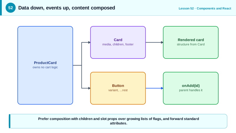
The Card no longer needs to know about badges, images or buttons, and the ProductCard reports events with onAdd rather than doing the cart work itself. Because Card forwards extra attributes, the caller could add aria-labelledby without any change to Card.
Real-World Examples
- The React documentation's guidance on passing JSX as children describes composition as the preferred way to make components flexible, and design systems such as Radix UI and shadcn/ui expose small composable parts rather than single components with long lists of configuration props.
- Brad Frost's Atomic Design methodology, widely used to organize design systems, describes building interfaces from small components composed into larger ones, an approach that maps directly to component composition in modern frameworks.
Review Questions & Answers
They are owned by the parent component. If a child changed them, the parent's data and the child's view would disagree and data flow would be impossible to trace. A child that needs a change asks the parent to make it through a callback prop.
Flags multiply with every new use case, creating many combinations that are hard to understand and test, and the component must anticipate every variation. Composition lets callers supply exactly the content they need, so the component stays small and stable.
After what happened in the child, such as onSelect, onChange or onSubmit, not after what the parent will do with it. This keeps the child independent of how it is used and makes the interface describe events, not implementation.
So consumers can add attributes the author did not anticipate, such as aria-describedby, data attributes, form attributes or extra event handlers, without changing the component. It keeps the component as capable and accessible as the native element it wraps.