Design Tokens and Design Systems Explained
On this page
Learning Objective
Explain what a design system contains beyond a component library, structure design tokens in primitive, semantic and component tiers and distribute them to CSS, platforms and design tools, build accessible, documented and versioned components, and run a design system as a product with adoption, contribution and governance.
Concept Explanation
As products grow, inconsistency creeps in: four shades of the brand purple, three different date pickers, buttons with slightly different padding, each team reinventing focus handling. A design system addresses this by providing one shared source for how the product looks and behaves. It is more than a component library. It includes foundations, such as color, typography, spacing, elevation and motion, expressed as design tokens; components with documented behavior and accessibility; patterns that describe how components combine for tasks such as forms or empty states; content guidelines for voice and microcopy; and the tooling, documentation and process that keep design and code in sync.
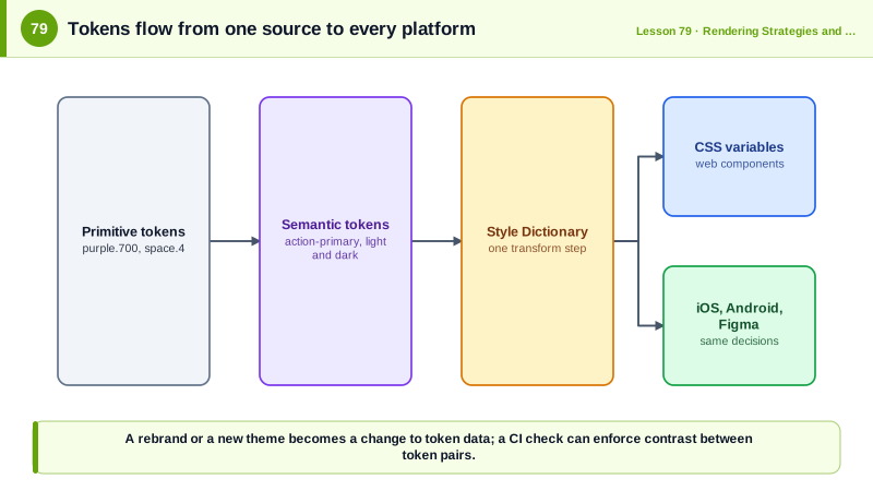
Design tokens are named design decisions stored as data, such as color.background.surface or space.4, rather than hard-coded values. Day 28 introduced two tiers in CSS; mature systems often use three. Primitive tokens define the raw palette and scales, such as purple.700. Semantic tokens map purpose to primitives, such as color.action.primary pointing to purple.700 in the light theme and purple.300 in dark mode. Component tokens, used sparingly, map specific component parts to semantic tokens, such as button.primary.background. Themes, brands and modes become different mappings of the same semantic names, so components never change when a theme does.
Tokens are stored in a platform-neutral format, often JSON following the W3C Design Tokens Community Group format, and transformed by tools such as Style Dictionary into CSS custom properties, Sass variables, TypeScript constants, iOS and Android resources and design tool variables. That single source keeps web, mobile and design files consistent, and it lets a rebrand ship by changing token values instead of thousands of lines of CSS.
Components are the most visible part. Good design system components are accessible by default, building on the patterns of Phase 2 and Day 60, so every team inherits correct focus handling, keyboard behavior and ARIA. They expose a small, consistent API, they are documented with live examples, usage guidance and do and do not examples, typically in Storybook, and they are tested with unit, interaction, visual regression and automated accessibility checks (Days 95 to 97). They are versioned with semantic versioning and changelogs, and breaking changes come with migration guides or automated codemods.
Running a design system is a product discipline. It has users, the product teams, and success is measured by adoption, consistency and the time saved, not by component count. Healthy systems have a clear contribution model so teams can propose additions, a balance between flexibility and consistency, often through the composable patterns of Day 60, and close collaboration between designers and engineers so the design tool library and the code library never drift. A system that is too rigid gets bypassed; one that accepts everything stops being a system.
| Layer | Contents | Example |
|---|---|---|
| Primitive tokens | Raw palette and scales | purple.700 = #6b21a8, space.4 = 16px |
| Semantic tokens | Purpose mapped to primitives | color.action.primary |
| Component tokens | Specific parts, used sparingly | button.primary.background |
| Components | Accessible, documented, tested | Button, Dialog, Combobox |
| Patterns | Combinations for tasks | Form layout, empty state |
| Guidelines | Usage and content rules | Voice, error message style |
| Tooling | Transforms, docs, tests | Style Dictionary, Storybook |
| Governance | Versioning and contribution | Semver, RFCs, office hours |
Worked Example: Tokens in JSON, Transformed to CSS and Used by a Component
The token source defines primitives and semantic tokens for light and dark themes. Style Dictionary generates CSS variables, and the component uses only semantic names.
{
  "color": {
    "purple": { "300": { "$value": "#d8b4fe", "$type": "color" }, "700": { "$value": "#6b21a8", "$type": "color" } },
    "gray": { "50": { "$value": "#f9fafb", "$type": "color" }, "900": { "$value": "#111827", "$type": "color" } }
  },
  "space": { "2": { "$value": "8px", "$type": "dimension" }, "4": { "$value": "16px", "$type": "dimension" } },
  "radius": { "md": { "$value": "8px", "$type": "dimension" } },
  "semantic": {
    "light": {
      "action-primary": { "$value": "{color.purple.700}" },
      "on-action-primary": { "$value": "{color.gray.50}" }
    },
    "dark": {
      "action-primary": { "$value": "{color.purple.300}" },
      "on-action-primary": { "$value": "{color.gray.900}" }
    }
  }
}/* Generated by Style Dictionary: tokens.css */
:root {
--space-2: 8px; --space-4: 16px; --radius-md: 8px;
--color-action-primary: #6b21a8; --color-on-action-primary: #f9fafb;
}
[data-theme="dark"] { --color-action-primary: #d8b4fe; --color-on-action-primary: #111827; }// Button uses semantic tokens only, so themes and rebrands need no component changes
export function Button({ variant = 'primary', ...props }: ButtonProps) {
return <button className={`ds-button ds-button--${variant}`} type="button" {...props} />;
}.ds-button--primary {
background: var(--color-action-primary);
color: var(--color-on-action-primary);
padding: var(--space-2) var(--space-4);
border-radius: var(--radius-md);
}
.ds-button:focus-visible { outline: 3px solid var(--color-action-primary); outline-offset: 2px; }A contrast check in CI can read the token file directly and fail the build if a semantic foreground and background pair falls below 4.5 to 1 in any theme, catching accessibility regressions before any component is touched.
Real-World Examples
- Salesforce coined the term design tokens for its Lightning Design System around 2014 and created the Theo tool to transform them for multiple platforms, and the W3C Design Tokens Community Group later developed a standard file format so tools such as Figma, Tokens Studio and Style Dictionary can interoperate.
- The UK government's GOV.UK Design System publishes components and patterns based on research with users of public services, together with the reasons behind each design decision, and is used across hundreds of government services so that citizens encounter consistent, accessible interfaces.
Review Questions & Answers
A named design decision, such as a color, spacing value, font size or duration, stored as platform-neutral data and referenced by name instead of hard-coding the value. Tools transform tokens into CSS variables, platform resources and design tool variables from one source.
Semantic tokens describe purpose, such as the primary action color, and themes map them to different primitive values. A component using semantic tokens works in every theme and brand automatically, whereas one using primitive values would need changes for each theme.
Foundations expressed as tokens, usage patterns for common tasks, content and accessibility guidelines, documentation with examples, tooling for transforming tokens and testing components, and a governance process for versioning, contribution and communication with product teams.
If it is too rigid, teams cannot meet legitimate product needs and bypass it, building their own components and reintroducing inconsistency. If it accepts every request, it becomes a large inconsistent collection that no longer provides a coherent experience.