CSS Box Model, box-sizing and Margin Collapse
On this page
Learning Objective
Describe the content, padding, border and margin areas of every box, use box-sizing border-box to make widths predictable, understand when vertical margins collapse and how to prevent it, and use logical properties so spacing works in any writing direction.
Concept Explanation
Every element the browser lays out generates a rectangular box made of four nested areas. The content area holds text and children. Padding surrounds the content and takes the element's background. The border wraps the padding. Margin sits outside the border, is always transparent and separates the box from its neighbors. DevTools draws this model for any selected element, and reading that diagram is the fastest way to answer most "why is there extra space here" questions.
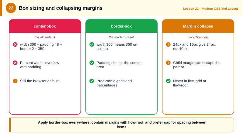
By default, width and height apply to the content box only. With box-sizing content-box, an element with width 300 pixels, 20 pixels of padding and a 2 pixel border is actually 344 pixels wide on screen, which makes layouts with percentages and padding painful. Setting box-sizing border-box makes width and height include padding and border, so a 300 pixel box is 300 pixels however much padding you add. Almost every modern reset applies border-box to all elements and pseudo-elements, and you should too.
Margin collapse is the box model's most surprising rule. In normal block flow, when the vertical margins of adjacent blocks touch, they collapse into a single margin equal to the larger of the two, not their sum. A paragraph with a bottom margin of 24 pixels followed by one with a top margin of 16 pixels has 24 pixels between them. Margins also collapse through parents: if a parent has no border, padding or other content separating it from its first child, the child's top margin escapes and appears above the parent instead. Negative margins collapse too, by adding the largest positive and the most negative.
Collapse only happens in block layout. Margins never collapse inside flex or grid containers, for floated or absolutely positioned elements, or across an element that creates a new block formatting context (Day 23). Horizontal margins never collapse. This is one reason modern layout favors gap on flex and grid containers instead of margins on children: gap only exists between items, never collapses, never leaks out of the container and needs no first-child or last-child exceptions.
Logical properties replace physical directions with flow-relative ones. margin-block-start means the top in horizontal writing, but the right in vertical Japanese writing; padding-inline-start means left in English but right in Arabic or Hebrew. Using margin-inline, padding-block, inset-inline-start and inline-size makes components work in right-to-left languages without separate stylesheets (Day 99).
| Area or rule | Meaning | Practical note |
|---|---|---|
| Content box | Where text and children go | width applies here with content-box |
| Padding | Space inside the border | Takes the background color |
| Border | Line around the padding | Counts toward size with border-box |
| Margin | Transparent space outside | Can collapse vertically in block flow |
| box-sizing: border-box | Width includes padding and border | Apply to everything in the reset |
| Margin collapse | Adjacent vertical margins merge | Not in flex, grid or new formatting contexts |
| gap | Space between flex or grid items | Never collapses or leaks |
| Logical properties | Flow-relative sides | margin-inline-start instead of margin-left |
Worked Example: Fixing an Escaping Margin and an Overflowing Card
The card's heading margin escapes the card and the card overflows its column because of padding. Two small changes fix both.
<class="tok-k">section class="column">
  <class="tok-k">article class="card">
    <class="tok-k">h2>Quarterly report</class="tok-k">h2>
    <class="tok-k">p>Revenue grew 12 percent.</class="tok-k">p>
  </class="tok-k">article>
</class="tok-k">section>/* Before */
.column { width: 320px; }
.card { width: 100%; padding: 24px; border: 1px solid #ddd; background: #faf5ff; }
.card h2 { margin-top: 32px; }
/* Problems:
1. The card is 320 + 48 + 2 = 370px wide and overflows the column.
2. The card has padding, so the h2 margin stays inside it here; but on a card variant
with padding-top: 0 the h2's 32px margin escapes above the card's background. */
/* After */
*, *::before, *::after { box-sizing: border-box; } /* width now includes padding and border */
.card {
display: flow-root; /* new block formatting context: margins stay inside */
padding-block: 24px;
padding-inline: 24px; /* logical: correct in right-to-left too */
}
/* Prefer gap over sibling margins for vertical rhythm */
.stack { display: flex; flex-direction: column; gap: 1rem; }
.stack > * { margin-block: 0; }Select the card in DevTools and compare the box model diagram before and after: the computed width drops from 370 to 320 pixels, and the escaping margin appears inside the card's background once flow-root creates a formatting context.
Real-World Examples
- Paul Irish's 2012 article "box-sizing: border-box FTW" popularized applying border-box to every element, and the rule now appears in virtually every modern reset, including Andy Bell's and Josh Comeau's widely used custom CSS resets.
- Bootstrap 5 replaced many directional utilities and properties with logical ones in its right-to-left support, generating its RTL stylesheet from the same source, an approach that relies on spacing being expressed in terms of start and end rather than left and right.
Review Questions & Answers
230 pixels: 200 for the content, 20 for padding on both sides and 10 for borders on both sides. With border-box it would be exactly 200 pixels, and the content area would shrink to 170.
30 pixels. In block layout adjacent vertical margins collapse to the larger of the two instead of adding up.
When the parent has no top border, top padding, inline content or new formatting context separating it from the first child, their top margins are adjacent and collapse together, so the combined margin is placed outside the parent. Adding padding, a border or display flow-root prevents it.
gap only adds space between items, so there is no extra space before the first or after the last item, it never collapses or leaks out of the container, and it requires no special first-child or last-child rules.