Responsive Design: Media Queries and clamp()
On this page
Learning Objective
Build layouts that adapt to any screen: start mobile first, choose breakpoints from content rather than devices, use modern media query range syntax and feature queries, scale typography and spacing fluidly with clamp(), and handle viewport units correctly on mobile browsers.
Concept Explanation
Responsive design means one codebase that adapts to every viewport, input method and user setting. The foundation is the viewport meta tag from Day 18 plus flexible layout from flexbox and grid, which already adapt to available space. Media queries then make the larger structural changes, such as moving a sidebar beside the content instead of below it. The mobile first approach writes the base styles for the narrowest screens and adds complexity with min-width queries. It tends to produce simpler CSS, because small screens get the least code and wider layouts layer on top.
Breakpoints should come from the content, not from a list of device widths. Resize the browser slowly and add a breakpoint where the design starts to break: lines become too long to read, a navigation bar no longer fits, cards become too narrow. Expressing breakpoints in em or rem units makes them respond to the user's font size, so someone who enlarges text gets the narrower layout sooner, which is exactly what they need. The modern range syntax, such as width >= 48rem or 30rem <= width < 64rem, is clearer than min-width and max-width and is supported in all current browsers.
Media queries are not only about width. Interaction media features describe the input: hover: hover and pointer: fine indicate a mouse, while pointer: coarse indicates touch, which needs larger targets. User preference queries such as prefers-reduced-motion and prefers-color-scheme were covered on Day 16. Feature queries with @supports let you use a new feature when it is available while keeping a fallback, for example @supports (grid-template-rows: subgrid).
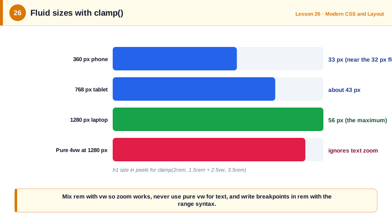
Fluid typography avoids the jumpy feel of changing font sizes at breakpoints. The clamp(min, preferred, max) function returns the preferred value clamped between bounds. A preferred value that mixes rem and viewport units, such as 1rem + 2vw, grows smoothly with the viewport while the rem part keeps it responsive to the user's zoom and font settings. Pure vw font sizes are an accessibility bug: they do not grow when users zoom text, which WCAG requires. The same clamp technique works for spacing, so gutters and section padding scale with the screen.
Viewport units have a mobile trap. On phones, browser toolbars appear and disappear as users scroll, so 100vh is taller than the visible area when the toolbar is showing, and a full-screen hero hides its bottom content. The newer units fix this: svh is the small viewport height with toolbars visible, lvh the large one with toolbars hidden, and dvh the dynamic height that updates as toolbars move. Use svh for layouts that must always fit and dvh sparingly, since it changes during scrolling.
| Tool | Syntax | Use |
|---|---|---|
| Mobile first query | @media (width >= 48rem) | Add layout for wider screens |
| Range query | @media (30rem <= width < 64rem) | Target a band of widths |
| Input query | @media (pointer: coarse) | Larger touch targets |
| Feature query | @supports (container-type: inline-size) | Progressive enhancement |
| Fluid size | clamp(1.25rem, 1rem + 1.5vw, 2rem) | Type and spacing that scale smoothly |
| Mobile viewport height | 100svh, 100dvh | Full-height sections without toolbar bugs |
Worked Example: Fluid Type Scale and a Mobile First Layout
The type scale grows smoothly between small and large screens. The layout adds columns only where content needs them, with breakpoints in rem.
:root {
  /* Fluid type: never smaller than min, never larger than max, rem keeps zoom working */
  --step-0: clamp(1rem, 0.95rem + 0.25vw, 1.125rem);
  --step-1: clamp(1.25rem, 1.1rem + 0.6vw, 1.6rem);
  --step-2: clamp(1.6rem, 1.3rem + 1.4vw, 2.4rem);
  --step-3: clamp(2rem, 1.5rem + 2.5vw, 3.5rem);
  --space-section: clamp(2rem, 1rem + 4vw, 6rem);
}

body { font-size: var(--step-0); line-height: 1.6; }
h1 { font-size: var(--step-3); line-height: 1.1; }
h2 { font-size: var(--step-2); }
section { padding-block: var(--space-section); }
.prose { max-width: 65ch; }                  /* readable line length */

/* Mobile first: one column by default */
.product { display: grid; gap: 1.5rem; }

@media (width >= 48rem) {                     /* the gallery and details now fit side by side */
  .product { grid-template-columns: 1fr 1fr; }
}
@media (width >= 80rem) {
  .product { grid-template-columns: 2fr 1fr; }
}

/* Touch devices get larger targets */
@media (pointer: coarse) {
  .toolbar button { min-block-size: 44px; min-inline-size: 44px; }
}

/* Full-height hero that always fits on phones */
.hero { min-block-size: 100svh; }
Test by dragging the responsive mode handle in DevTools rather than only clicking device presets, and by setting the browser's default font size to 24 pixels: the rem breakpoints should switch to the simpler layout earlier and the text should stay readable.
Real-World Examples
- Ethan Marcotte coined the term responsive web design in a 2010 A List Apart article that combined fluid grids, flexible images and media queries, and the approach became the default way to build for the web as mobile traffic grew to more than half of all web visits.
- The small, large and dynamic viewport units shipped across Safari 15.4, Firefox 101 and Chrome 108 in 2022, addressing the long-standing problem that 100vh content was cut off behind mobile browser toolbars.
Review Questions & Answers
They scale with the user's font size setting. A user who increases the default font size reaches the narrower, single-column layout at a wider viewport, which keeps lines readable and prevents enlarged text from overflowing a layout designed for smaller text.
Viewport units depend only on the window width, so the text does not grow when the user zooms text or increases the browser font size, which WCAG requires. Mixing rem with vw inside clamp keeps the fluid behavior while still responding to user settings.
Mobile browsers' toolbars change the visible height while scrolling, and 100vh usually corresponds to the largest viewport, so content at the bottom of a 100vh section can be hidden behind toolbars. svh uses the smallest viewport, lvh the largest and dvh tracks the current one.
Resize the layout and observe the content: add a breakpoint where it starts to look or work badly, such as overly long lines, crowded navigation or cramped cards. Breakpoints based on popular device widths become outdated and do not reflect what the content needs.